To help minimize distractions, keep interactions between the driver and screen simple, non-distracting, and easy to interrupt.
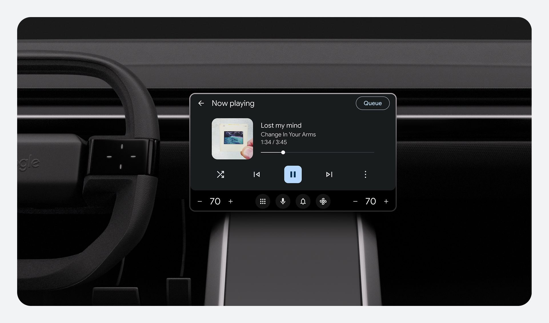
Make content glanceable
- A driver should be able to read content and understand the system state within 2 seconds.
- After a driver interacts with the system, the system should respond within 0.25 seconds.
- If content takes more than 2 seconds to load, use a spinner or similar indicator to show that the device is responding.
Encourage hands-on driving
- Drivers should only need to use one hand for gestures. Only require gestures that won't distract from the drive.
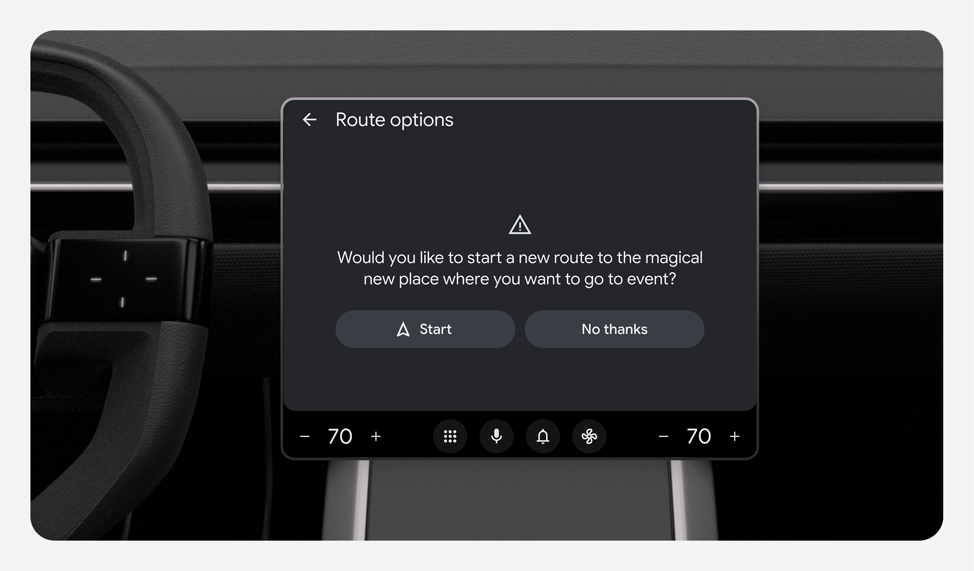
- Include robust voice controls so drivers can interact with apps hands-free. However, it's okay to start, end, or interrupt a spoken dialog manually.
Prioritize driving-related tasks
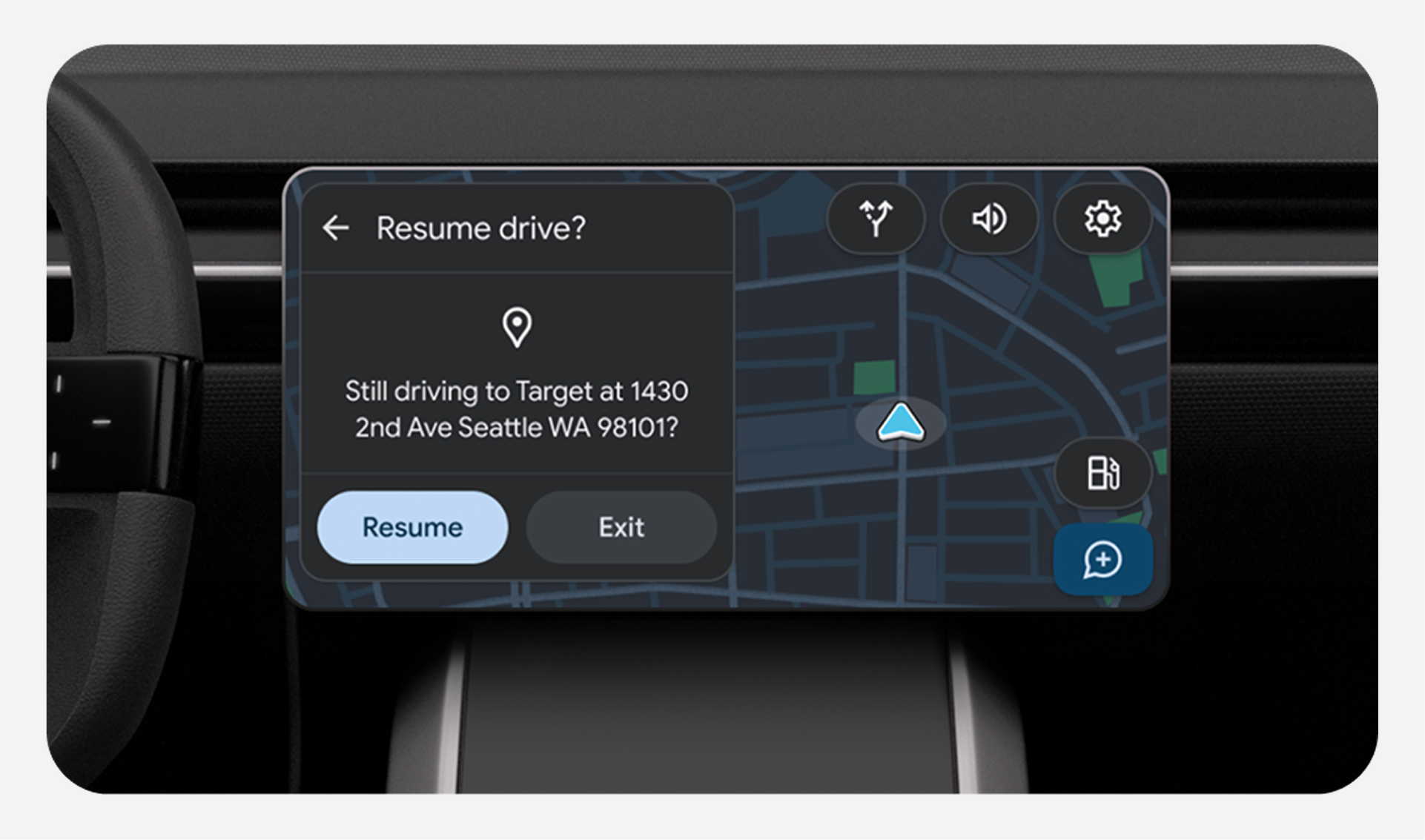
- Allow drivers to interrupt and resume non-driving-related tasks when appropriate. Prioritize information needed for safe driving (like navigation directions) over other content.
- While a driver is speaking navigation directions, lower or duck other media volume. Provide an option to mute media volume as well.
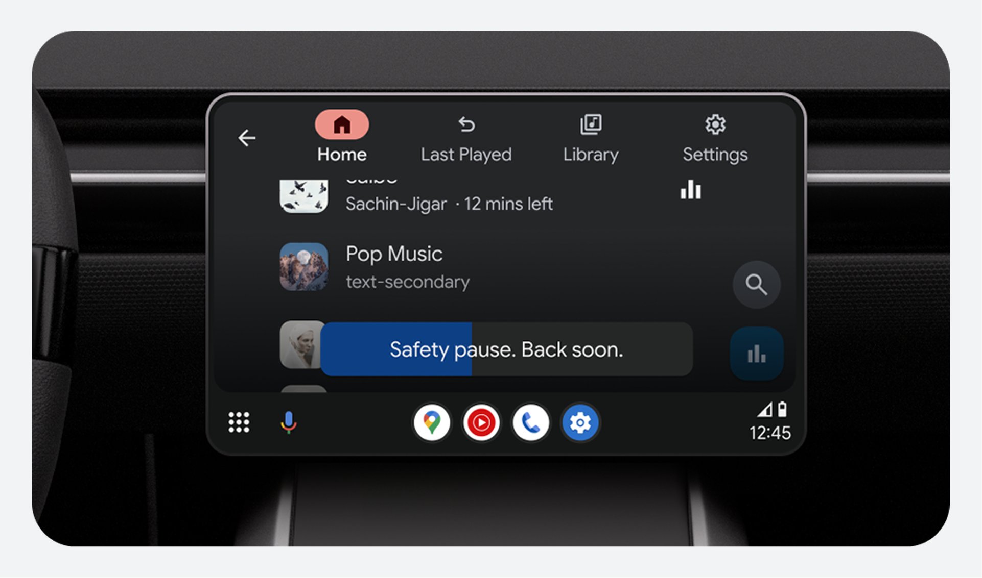
Minimize distractions
- Restrict access to potentially distracting activities (like games or web browsing) while driving. Use visual differences to clarify which apps and features can and can't be used while driving.
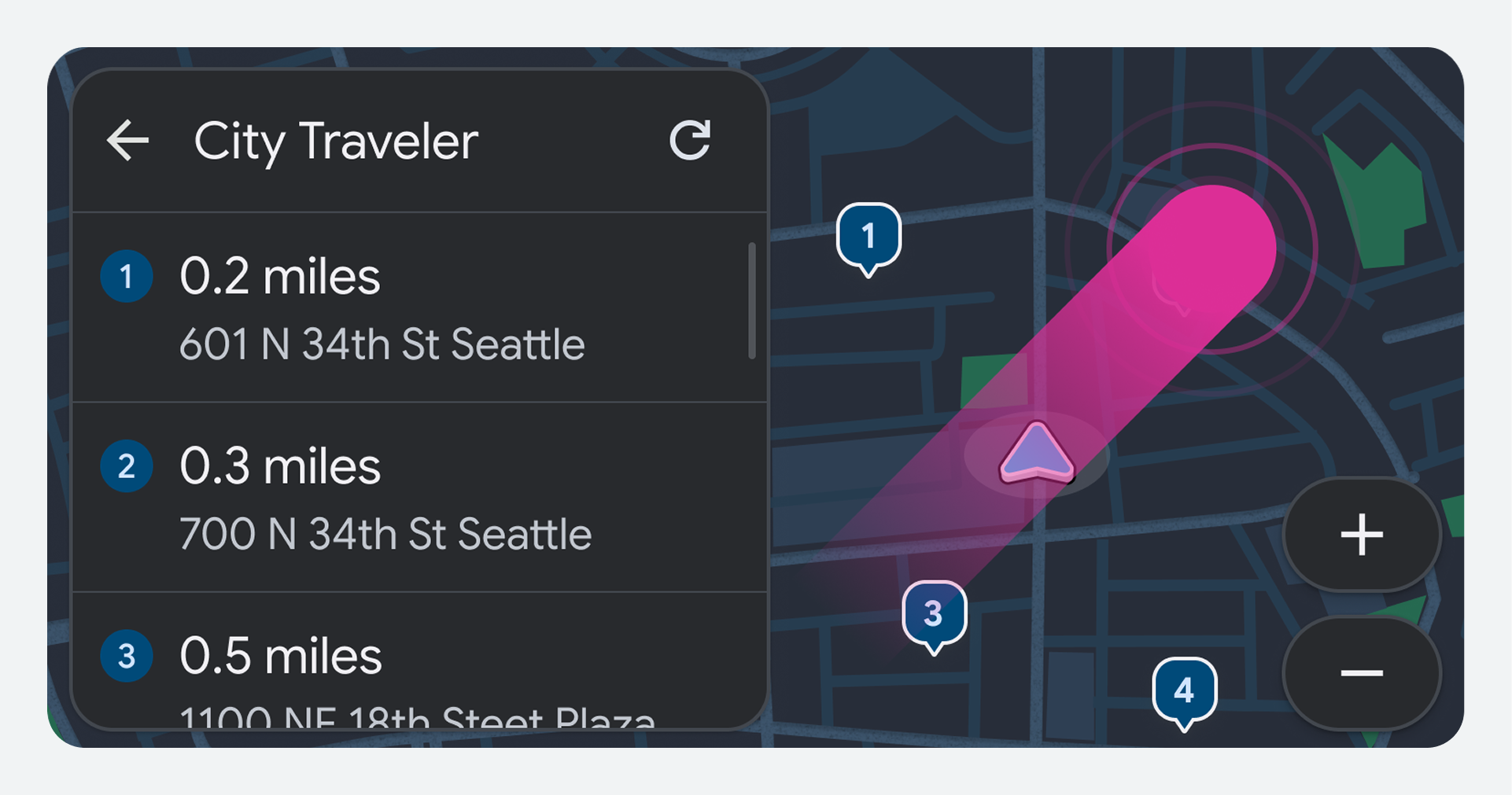
- Avoid showing dynamic visual information such as videos and auto-scrolling text while driving.
- Suppress notifications when the driver is in the middle of a maneuver.
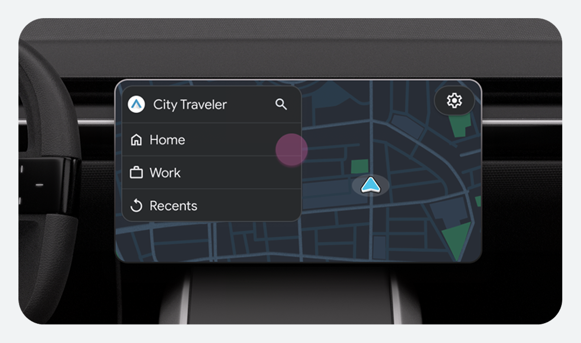
Visual principles
Make sure the content you design for car screens is legible and glanceable. The UI should be consistent and touch targets should be large enough for drivers to quickly identify under all viewing conditions.
Use contrast to improve visibility
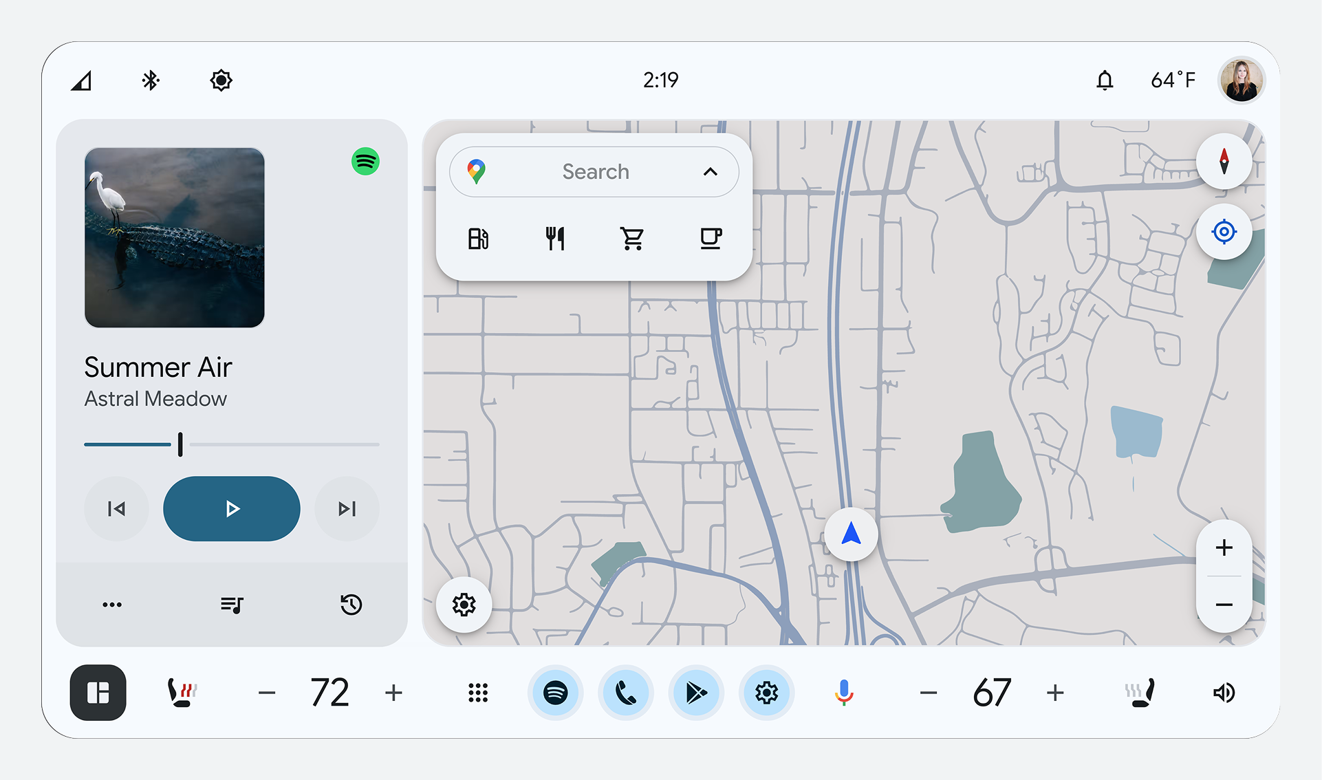
- During daytime, use Day Mode (dark text on a light background) for better visibility.
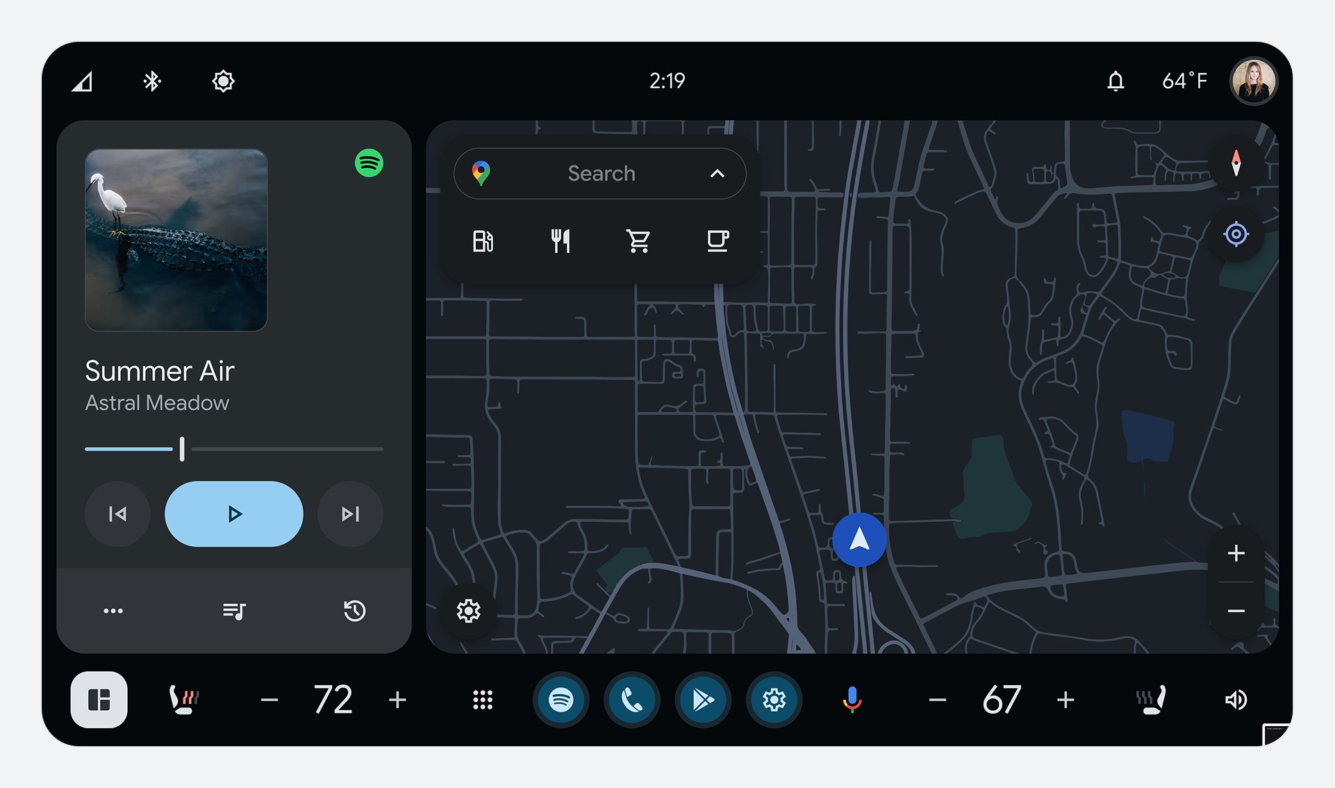
- During nighttime, use Night Mode (light text on a dark background) for better visibility.
- The contrast ratio for icons, text, and other images must be at least 4.5:1.
- If an icon and text mean the same thing, only one element needs to meet contrast guidelines. For rotary inputs, the contrast guidelines must be met for the highlight against the background.
Keep text brief and glanceable
- For text items using the Roman alphabet, you can use up to 120 characters, including punctuation and spaces.
- For text items in Japanese, you can use up to 31 Roman characters, kana, or kanji combined.
- Primary text (used for decision making) should be 32dp. Secondary text should be 24dp.
Make touch targets easy to touch
- The minimum size for touch targets is 76 x 76dp.
- Allow at least 23dp between touch targets. If needed, you can use a zoom option to prevent touch targets from overlapping.
Use consistent UI elements
- Use consistent and predictable icons, terminology, and interaction patterns.