Learn how to implement your unique brand identity across the entire infotainment system for a cohesive, driving-optimized experience.
Create a cohesive look and feel with design tokens
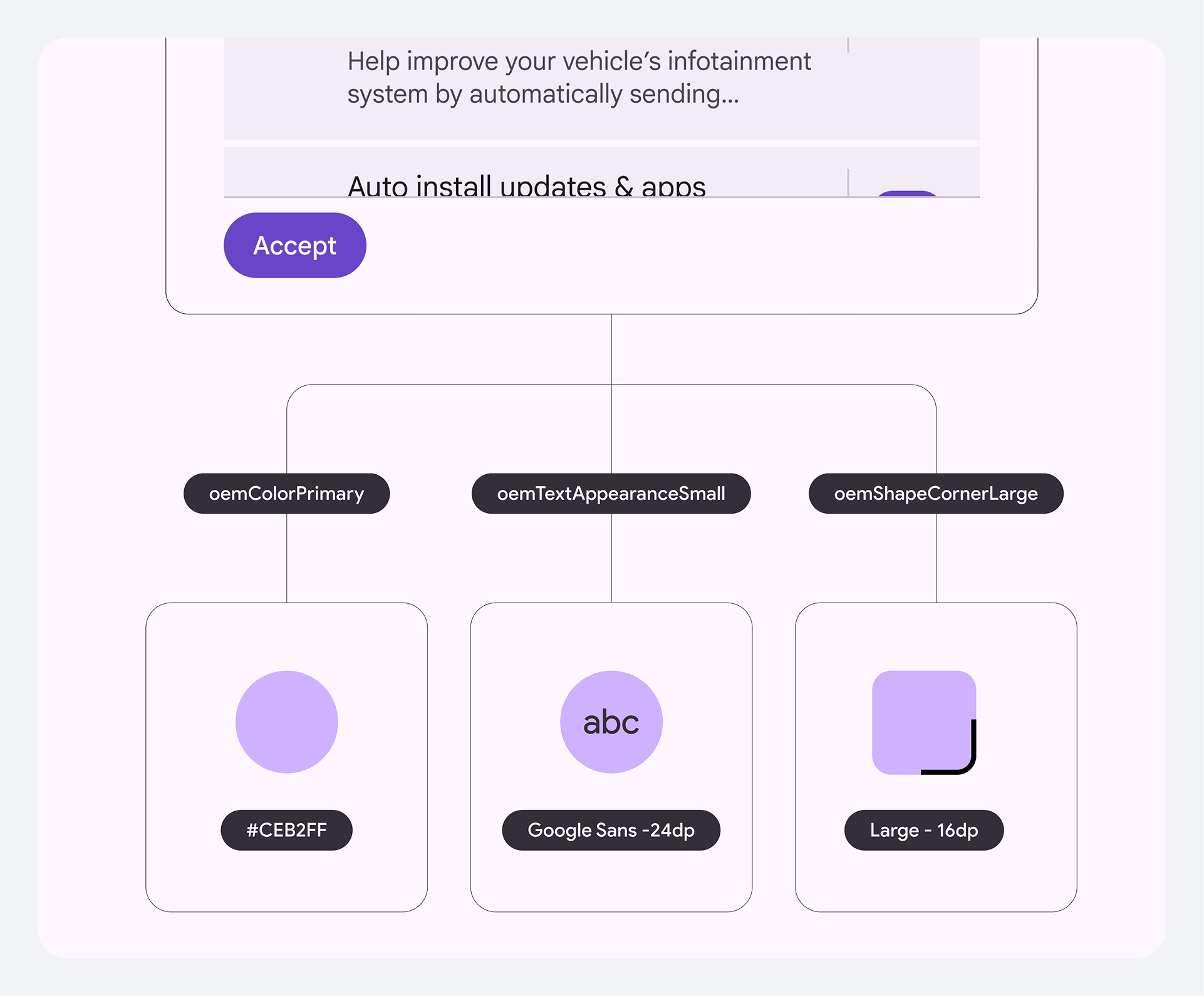
Design tokens are the fundamental building blocks of all UI elements, allowing you to manage your brand's look across the entire system without time-consuming code changes.
Have one source of truth
Tokens are reusable design values (like colors, fonts, and dimensions) that replace static code. By defining these token values, you gain full control over the system's core styling and ensure your brand identity is the single source of truth across every app in the system.
Standardize design decisions across the system
Tokens dynamically apply customized values across the entire system. This avoids
the need for deep code changes and ensures designers and engineers "speak the
same language," creating a seamless handoff from design to final
implementation.
Customize color and theming
The platform gives you control over the overall aesthetic while maintaining critical safety standards. You can customize the base theme and color palette through resource overlays to reflect your brand's unique style.
Optimize for day and night driving
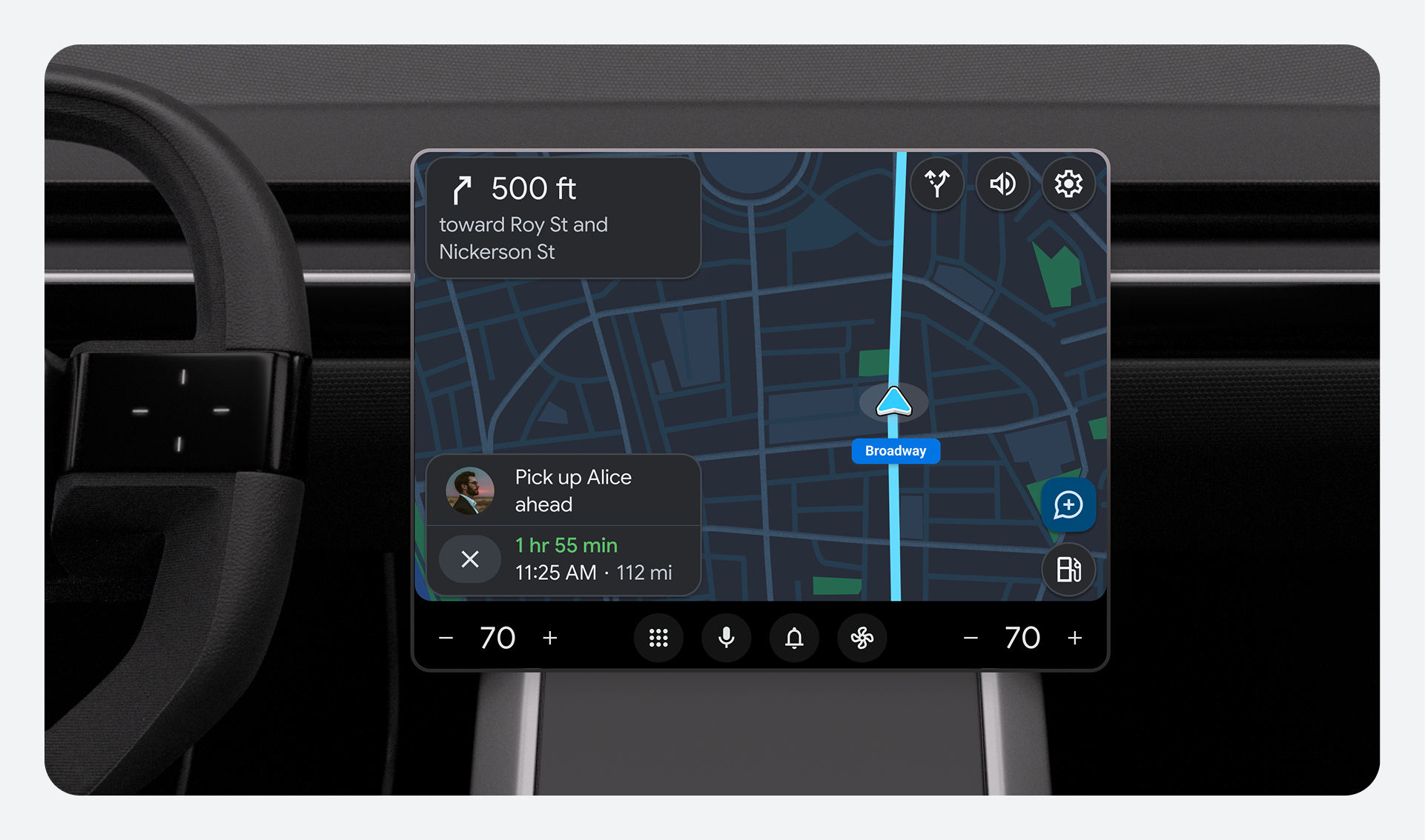
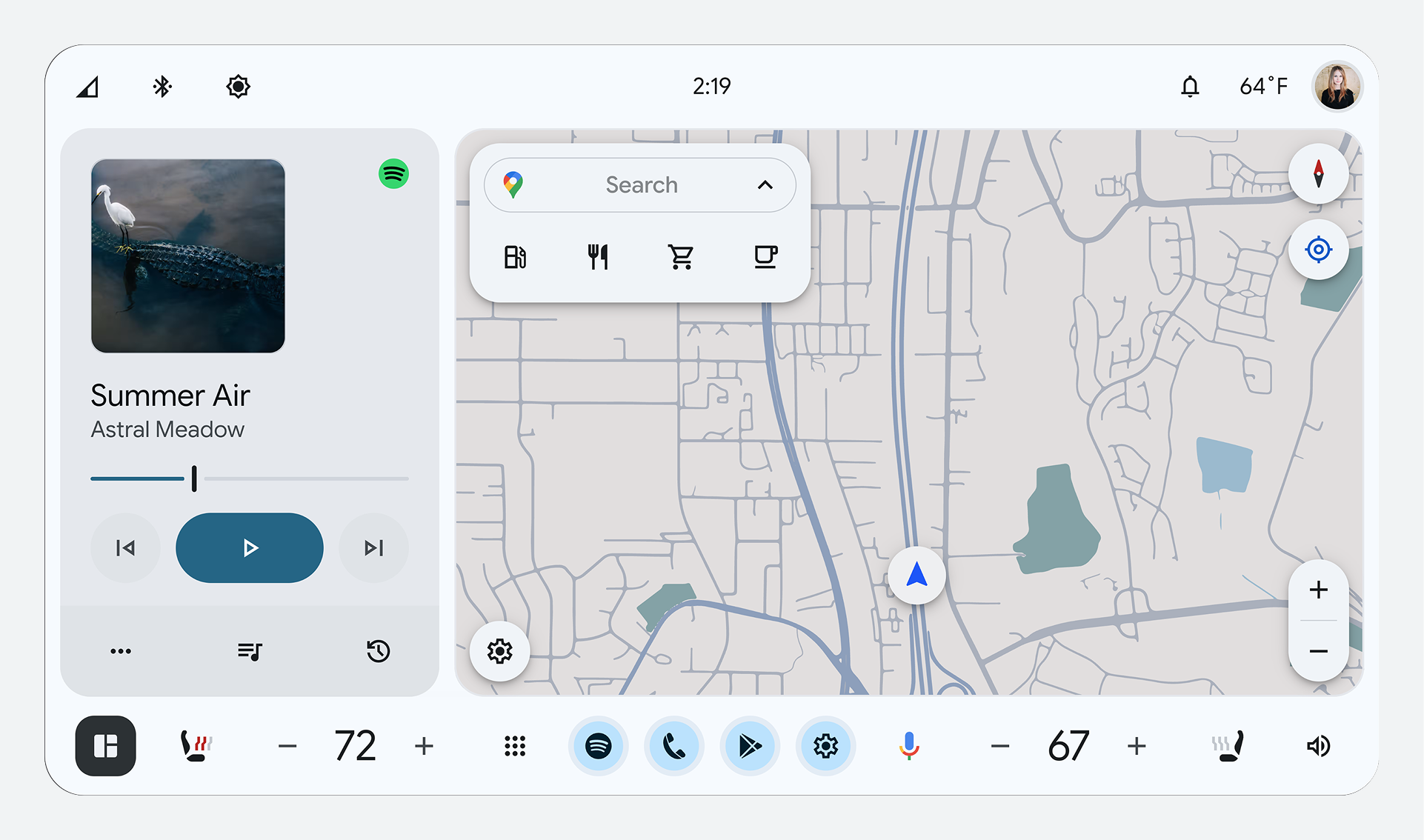
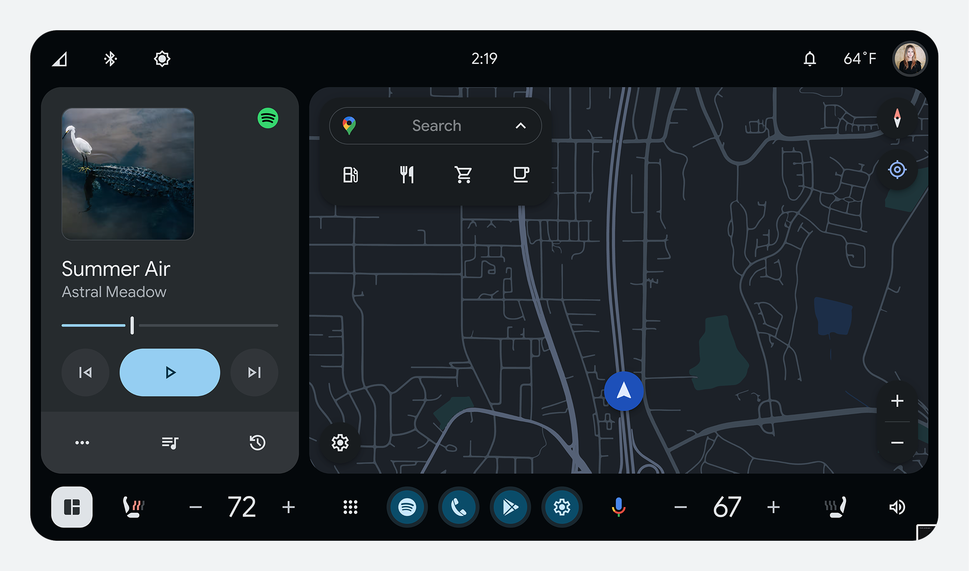
During daytime, Day Mode (dark text on a light background) provides better visibility. During nighttime, Night Mode (light text on a dark background) provides better visibility.
Optimize the contrast ratio for glanceability
All elements must maintain a minimum color contrast ratio of 4.5:1 between text and icons and the background, for legibility while driving.
| 
|
Create a clear visual hierarchy between components
It's important to reduce the amount of time drivers spend looking at the screen. To create a visual hierarchy that guides the driver's eye where it needs to go, you can customize the corners and proportions of components.
Use rounded corners for emphasis
Google Built-In uses shapes and rounding to communicate importance. More rounded corners (larger radius) are used for primary actions and components, while less-rounded corners (smaller radius) are used for low-emphasis elements.
The system provides specific corner radius values (for example, 0dp, 4dp, 8dp,
16dp, circular) that you choose from to adjust the size, shape, and button
proportions of templates to fit your vehicle displays.