This page explains how to create a flow for the Setup Wizard (SUW), create a narrative, and include required and optional steps.
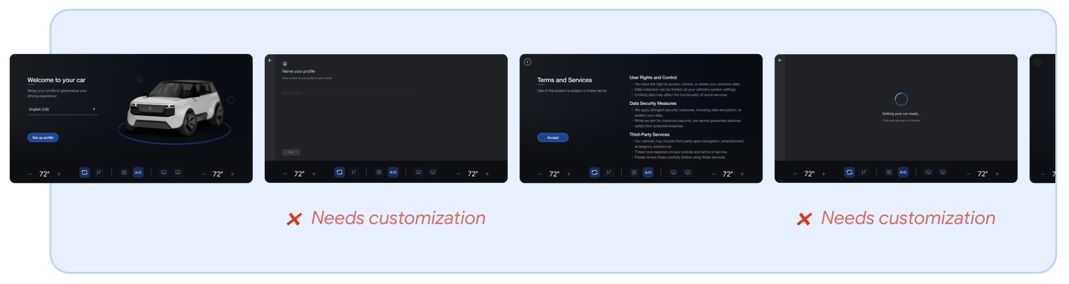
You can customize the following screens:
| Limited customization: Content modal | Required customization: Google-provided templates |
|---|---|
| Google Terms of Service Google Sign-in Google Gemini Google Play |
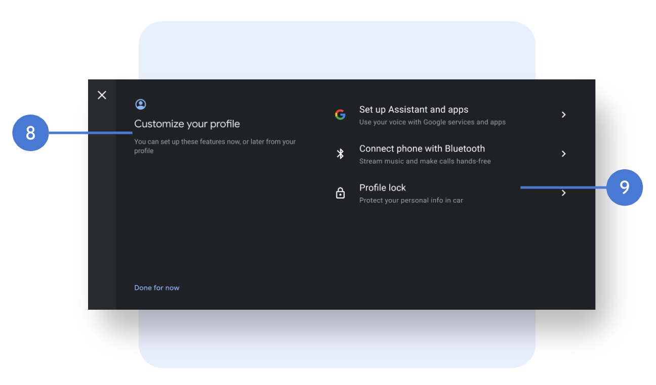
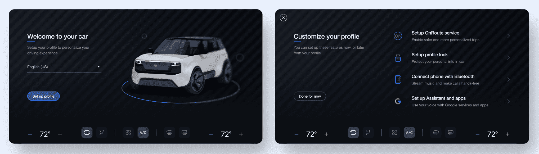
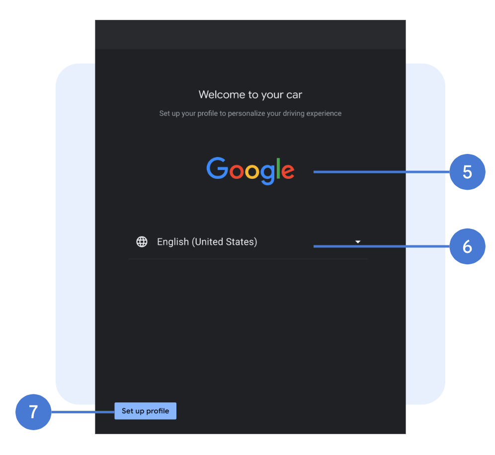
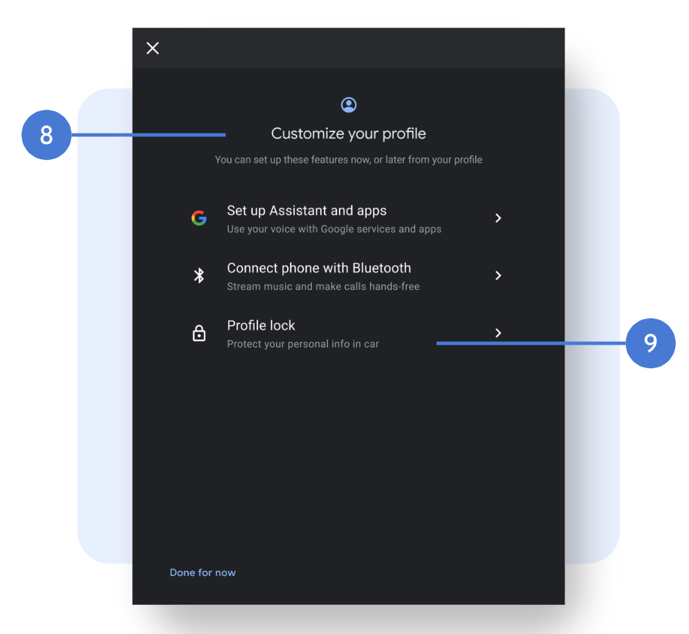
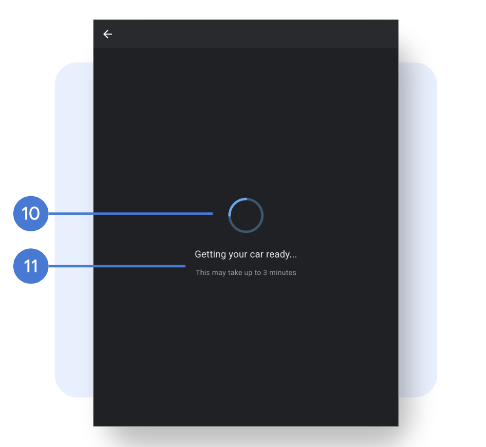
Welcome screen Language selection Connectivity and Wi-Fi setup Profile creation (name profile) Summary screen Bluetooth device setup Profile protection (profile lock setup) Loading screens |
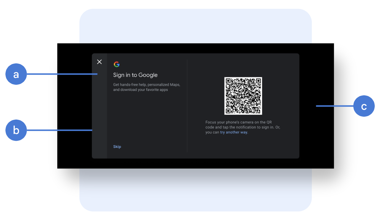
Customize the content model
The content modal, or AppStyledView UI component, houses Google proprietary
screens, including the Google sign-in module and Google services consent. To
help the user understand that they're interacting with Google, and not the car
maker, the modal component supports only limited customization.
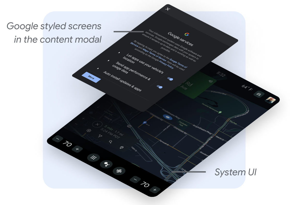
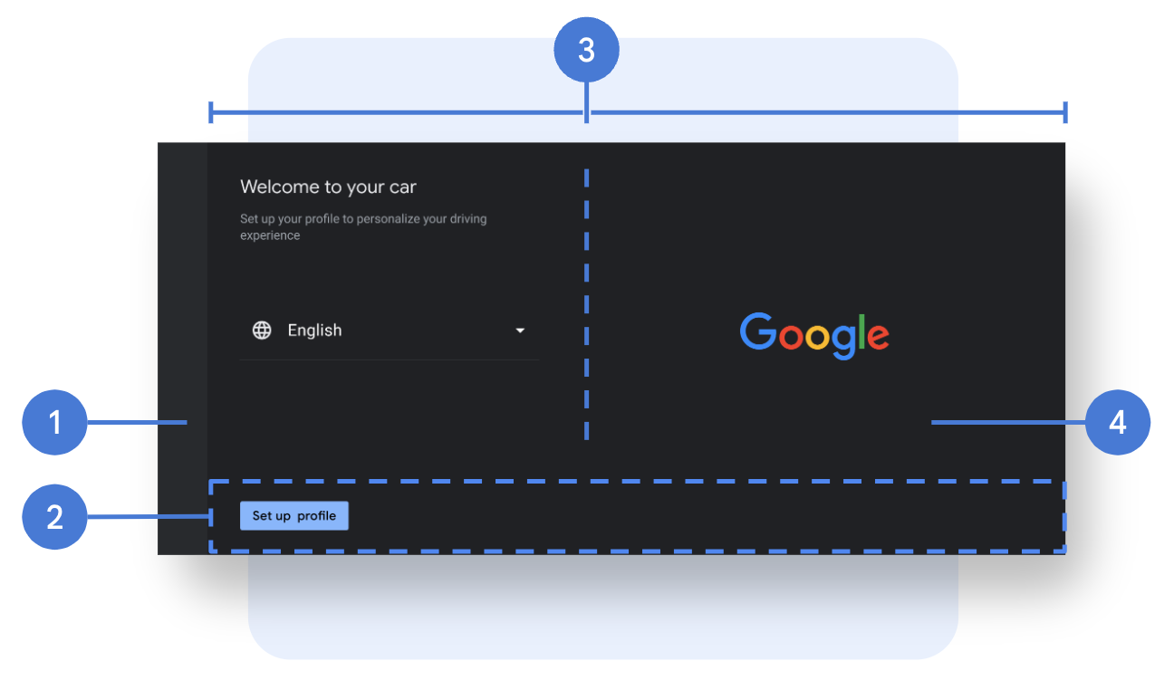
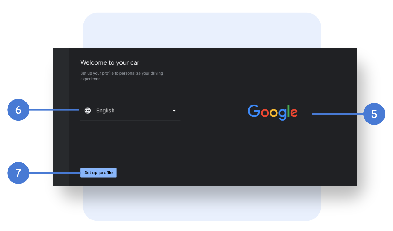
To achieve a cohesive integration, you can customize these:
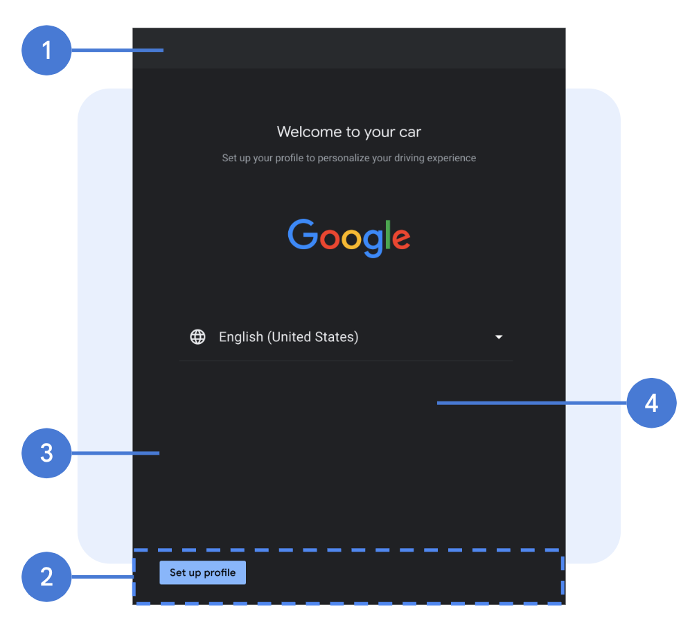
Navigation bar: You can choose to place the navigation bar at the top of the modal or to the side. In addition, you can customize the navigation icon (image, size, color, placement), background (image, opacity, color), width or height (depending on placement).
Modal setup: The width of the content area must be greater than 1224 dp for Google screens to be rendered in landscape layout. Beyond that, you can customize the modal width, height, placement in the screen, rounded corner, border styling. A full screen overlay is recommended when sufficient margins around the modal can't be guaranteed.
Modal background: Image or color, transparency.
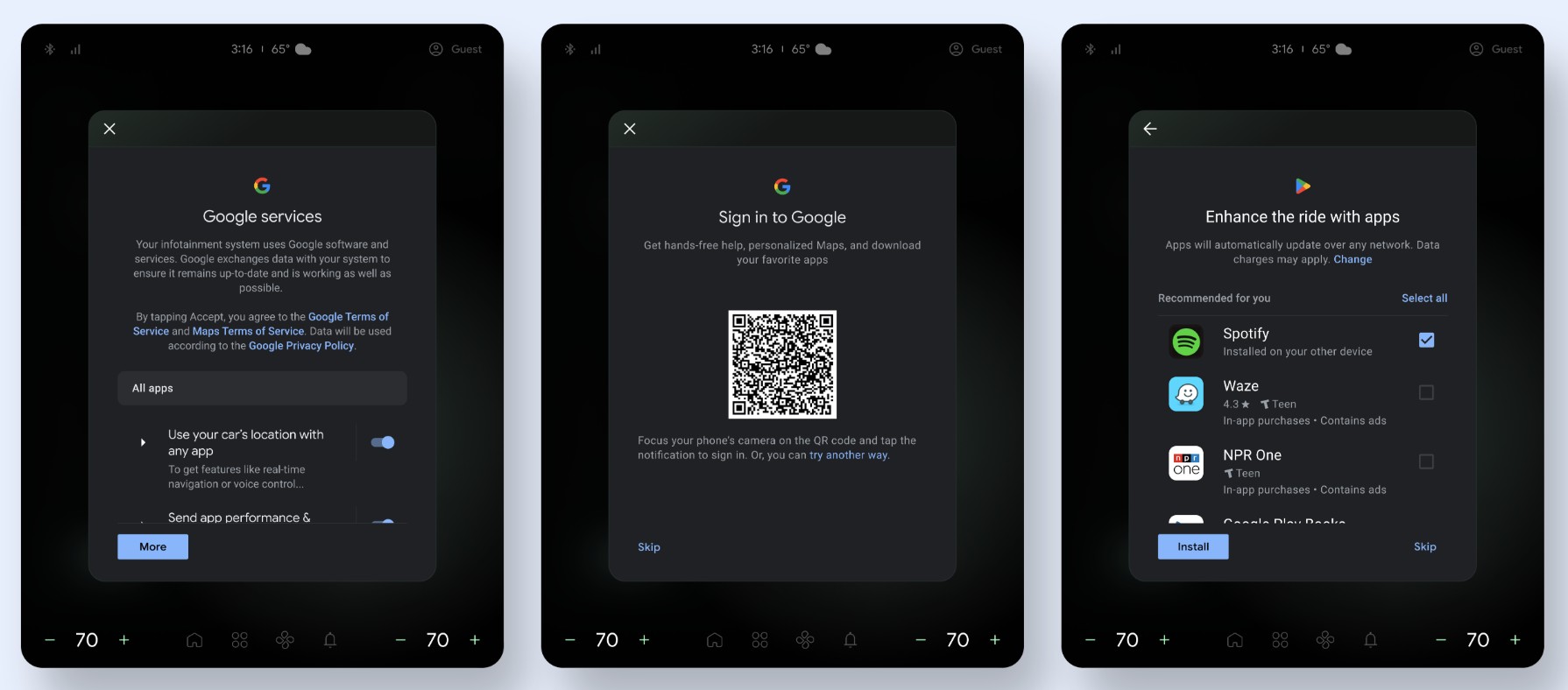
Examples of content modal customizations
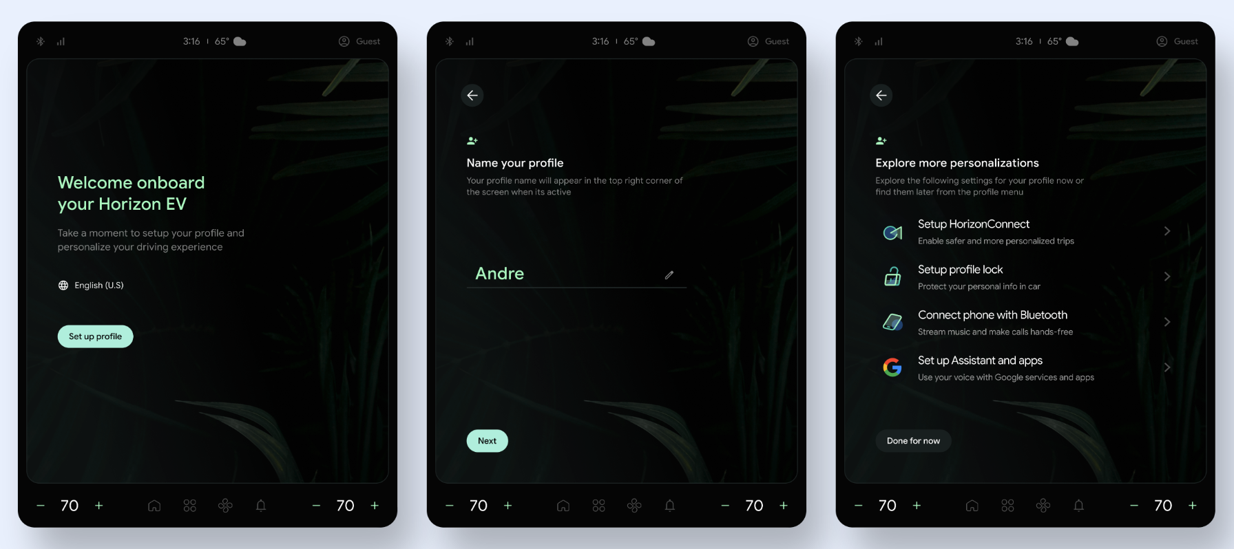
You can choose to use a Google-provided template as part of the setup flow. If you decide to use this option, you must customize these screens to avoid a mix of UI styles.
Here are samples of content modal customizations in Figure 3 and Figure 4.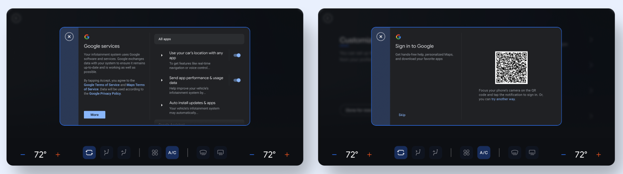
Customize Google-provided screens
You can choose to use a Google-provided template as part of the setup flow. If you decide to use this option, you must customize these screens to avoid a mix of UI styles.
Immersive versus nonimmersive views
You have two options for displaying SuW:
Immersive view: This view conceals nonessential features like the status bar and system UI. Use an immersive view to minimize distractions.
Nonimmersive view: This view lets users see system features like the status bar. Use a nonimmersive view only when it's critical to show system UI. If you choose to use this view, avoid actions that might take the user out of the setup experience.
Customize landscape layout
The customizable elements in landscape mode are the following:
Layout and background
- Navigation bar: The navigation bar houses the back button. You can customize the layout and background of the bar, and the navigation icon (image, size, color, and placement), background (image, opacity, color), and width.
- Action bar: The action bar is the container anchored at the bottom of the page that contains the call-to-action buttons, which are transparent by default. You can customize the height and padding of the bar, and the image, opacity and color of the background.
- Page layout: Column ratio and page margins.
- Page background: Background color or image.
Components
- Hero image: Image, size, and placement.
- Drop down: Font (family, size, color), icons (image, size, color), and divider line.
- Buttons: Font (family, size, color), background (image, opacity, color), button size (width, height), placement, paddings, rounded corners (styling for primary and secondary actions, as well as differentiated button states).
- Page header: Font (family, size, and color), title and subtitle placement, strings, and page icon (whether to include the icon, and the icon image, size, and color).
- List: Font (family, size, and color), icons (image, size, and color, Google icons aren't customizable), placement, paddings, list item height, and divider line. To change strings, you must review with Google.
Loading screens
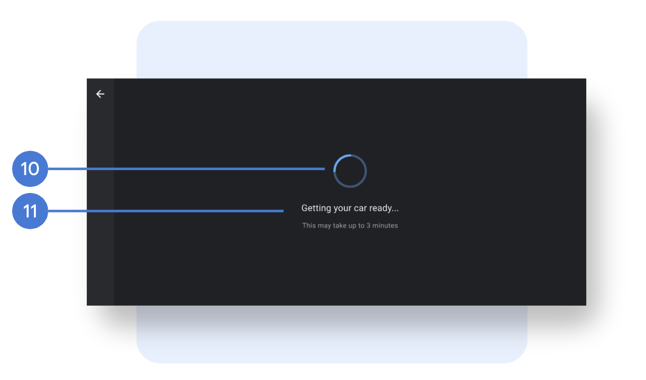
- Animation: (Indeterminate) or an image, size, placement.
- Strings: Font (family, size, and color), placement, and strings.
Sample customized landscape layout
Possible way to customize a welcome or summary screen is to use a Google-provided template.
Customize portrait mode
Following are the customizable elements in portrait mode.
Layout and background
- Navigation bar: The navigation bar houses the back button. You can customize the layout and background of the bar, and the navigation icon (image, size, color, and placement), background (image, opacity, color), and width.
- Action bar: The action bar is the container anchored at the bottom of the page that contains the call-to-action buttons, which are transparent by default. You can customize the height and padding of the bar, and the image, opacity and color of the background.
- Page layout: Page margins.
- Page BG: Background color or image.
Components
- Hero image: Image, size, placement.
- Drop-down: Font (family, size, color), icons (image, size, color), divider line.
- Buttons: Font (family, size, color), background (image, opacity, color), button size (width, height), placement, paddings, rounded corners. You should differentiate the styling for primary and secondary actions, and different button states.
- Page header: Font (family, size, color), title and subtitle placement, strings, page icon (whether to include the icon, and the icon image, size, and color).
- List: Font (family, size, and color), icons (image, size, and color, Google icons aren't customizable), placement, paddings, list item height, and divider line. To change strings, you must review with Google.
Loading screens
- Animation: Animation (indeterminate) or an image, size, placement.
- Strings: Font (family, size, color), placement, strings.
Sample customized portrait layout