Browsing views present categorized content, structured either as lists or grids, for user discovery.
Within these views, you can tag content items using indicators to clearly identify attributes such as explicit material, new additions, or in-progress status. Selecting a content item triggers one of two actions: either navigating to a lower-level view (for example, tracks within an album) or initiating playback. If the item is playable, selecting it transitions the user directly to the dedicated playback view.
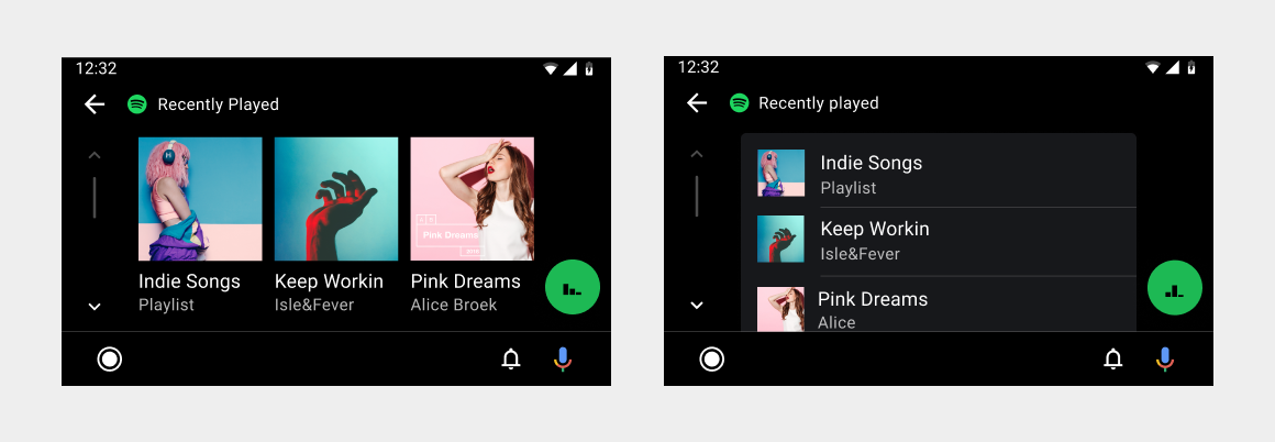
List and grid views
You can present content in a grid view, a list view, or a combination of both in the same content space. Grid views are best when users rely primarily on images to make their selections. List views are best when users rely on reading text and viewing data to make their selections.
For easier browsing, you can group content into categories separated by subheaders.
Content indicators
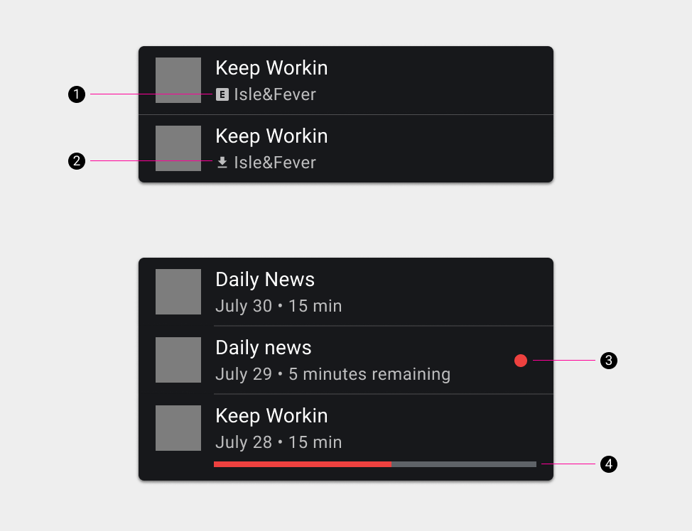
Content indicators are small visual indicators that help users distinguish between different types of content, such as downloaded content or explicit content.
The types of content indicators are:
- Explicit
- Downloaded
- New
- In progress (partially played)
The available content indicators are illustrated in the following figure: