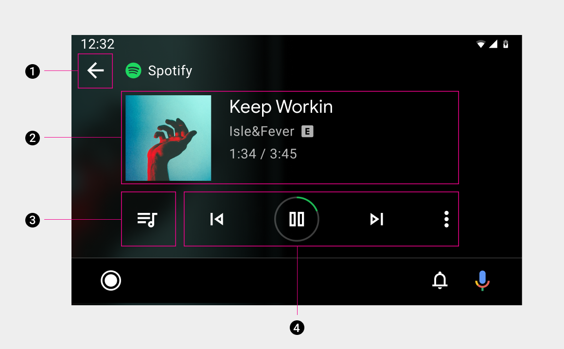
The playback view displays currently playing media and available actions.
Included in this view are:
- Back button
- Media metadata and elapsed time
- Queue button
- Playback controls with visual progress indicator
When there are more than five actions in the playback controls, apps can provide secondary actions through the overflow button.
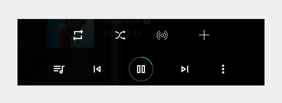
Primary actions
All media apps display typical media controls – such as Play/Pause, Previous, and Next – in an easily targeted action card that can include up to nine actions.
Apps with more than 5 actions should provide access to secondary actions by making the far right button an overflow button.
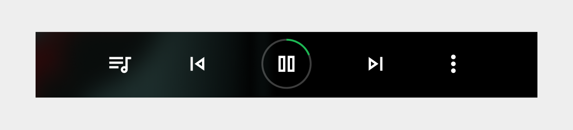
Action button locations
To ensure consistent usage across media services, actions must appear in the following order (from left to right) on the primary media controls: Playlist/Queue, Previous, Play/Pause, and Next, with an optional function in the rightmost position.
If your service doesn't use Previous or Next buttons, you can put other buttons in their positions.
| Position | Button |
|---|---|
| Far Left | Playlist/Queue |
| Left of center | Previous |
| Center | Play/Pause |
| Right of center | Next |
| Far right | Optional function |
Secondary actions
Apps can provide up to 4 secondary custom actions, such as thumbs up/down. The secondary actions slide up from the primary actions when a user selects the overflow button.