Android Automotive OS (AAOS) allows users to browse and play content from media apps on the car screen. Users can download media apps from Google Play directly to the car, with no phone needed.
This page includes the following sections:
Spatial model
This introduction to the media app template describes its main elements, the basic functions they provide, and the architecture that holds them together.
More detailed descriptions of how each element works are provided in the following sections.
Anatomy
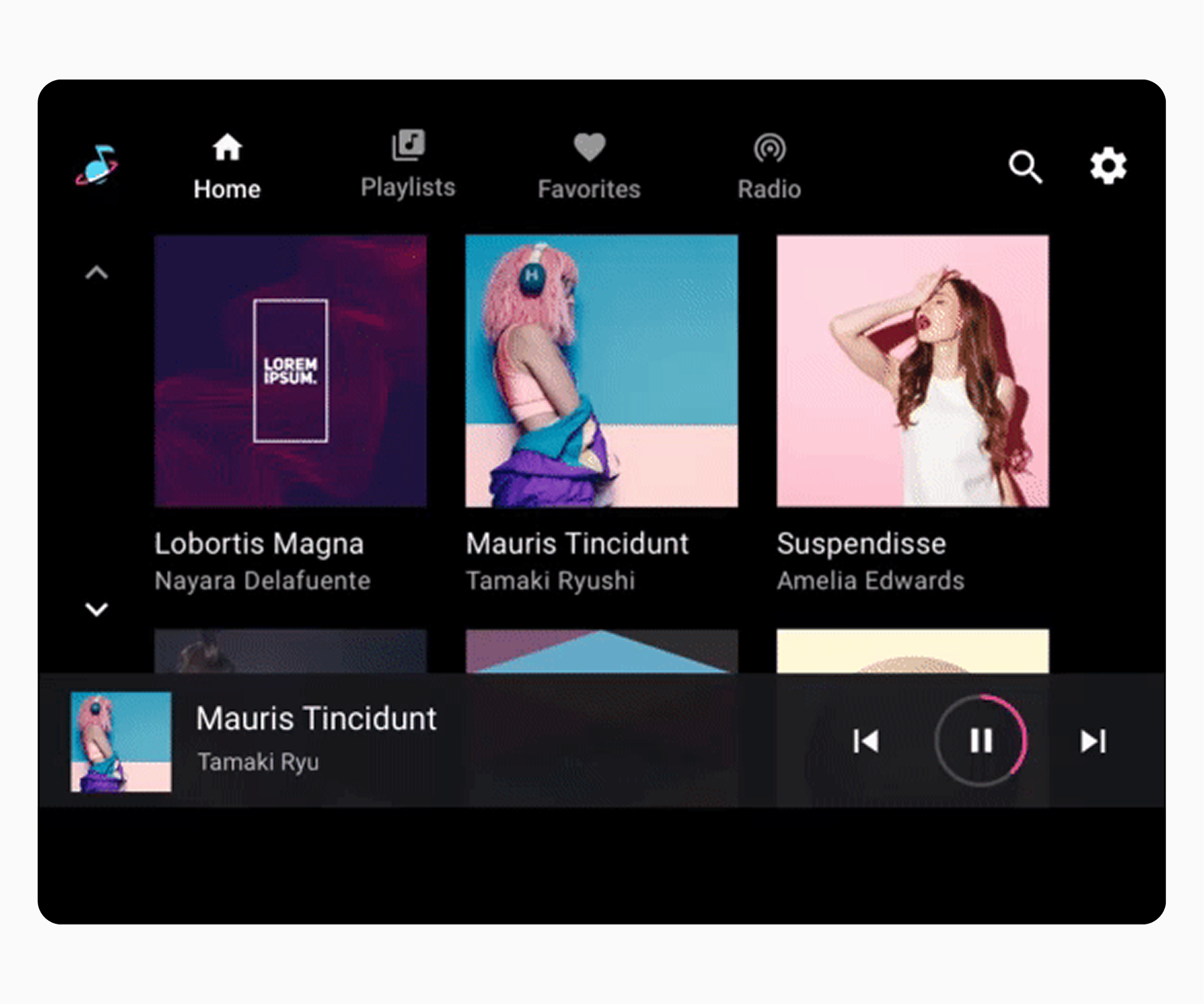
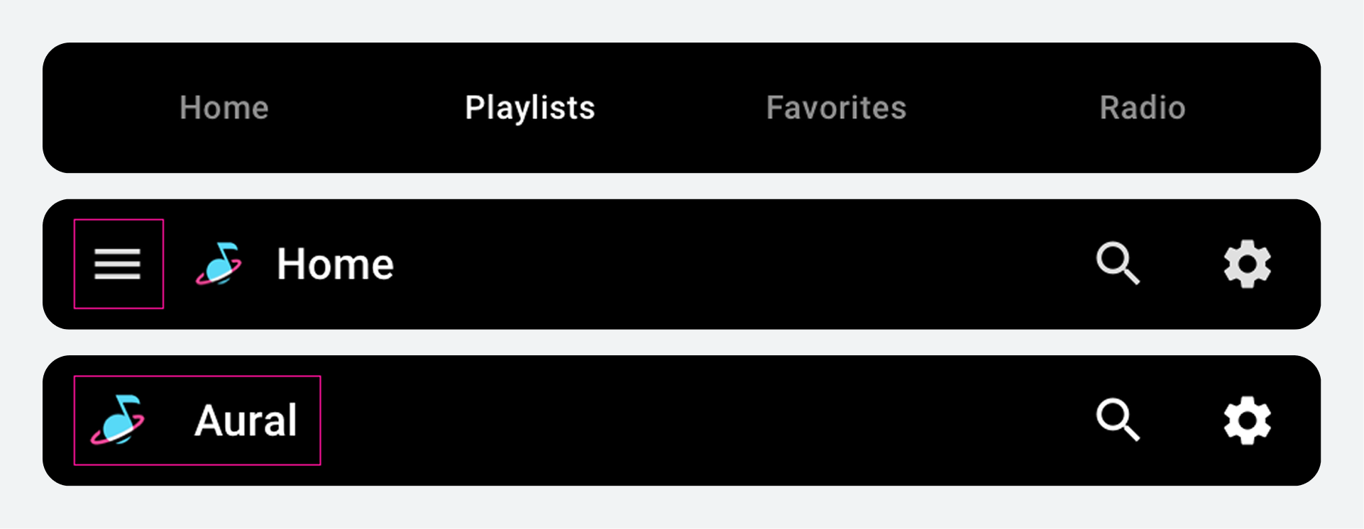
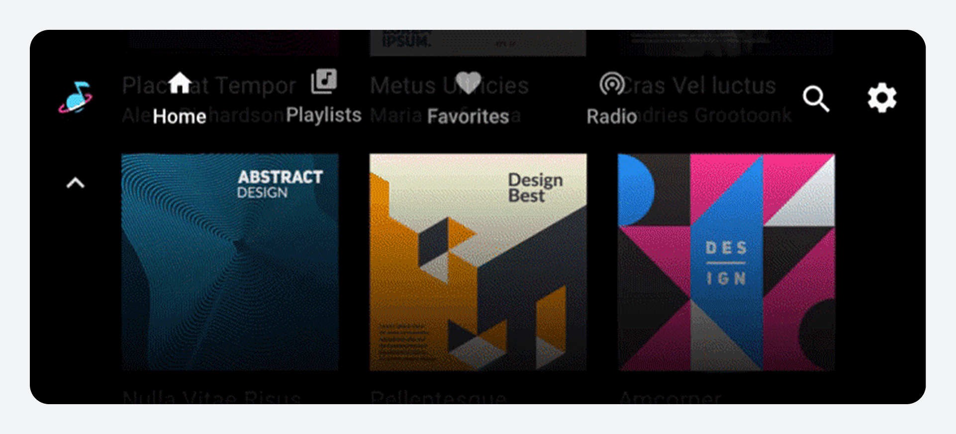
The media template includes the following:
- App bar – Features primary app navigation and app controls (for in-app search and settings) and includes an app icon
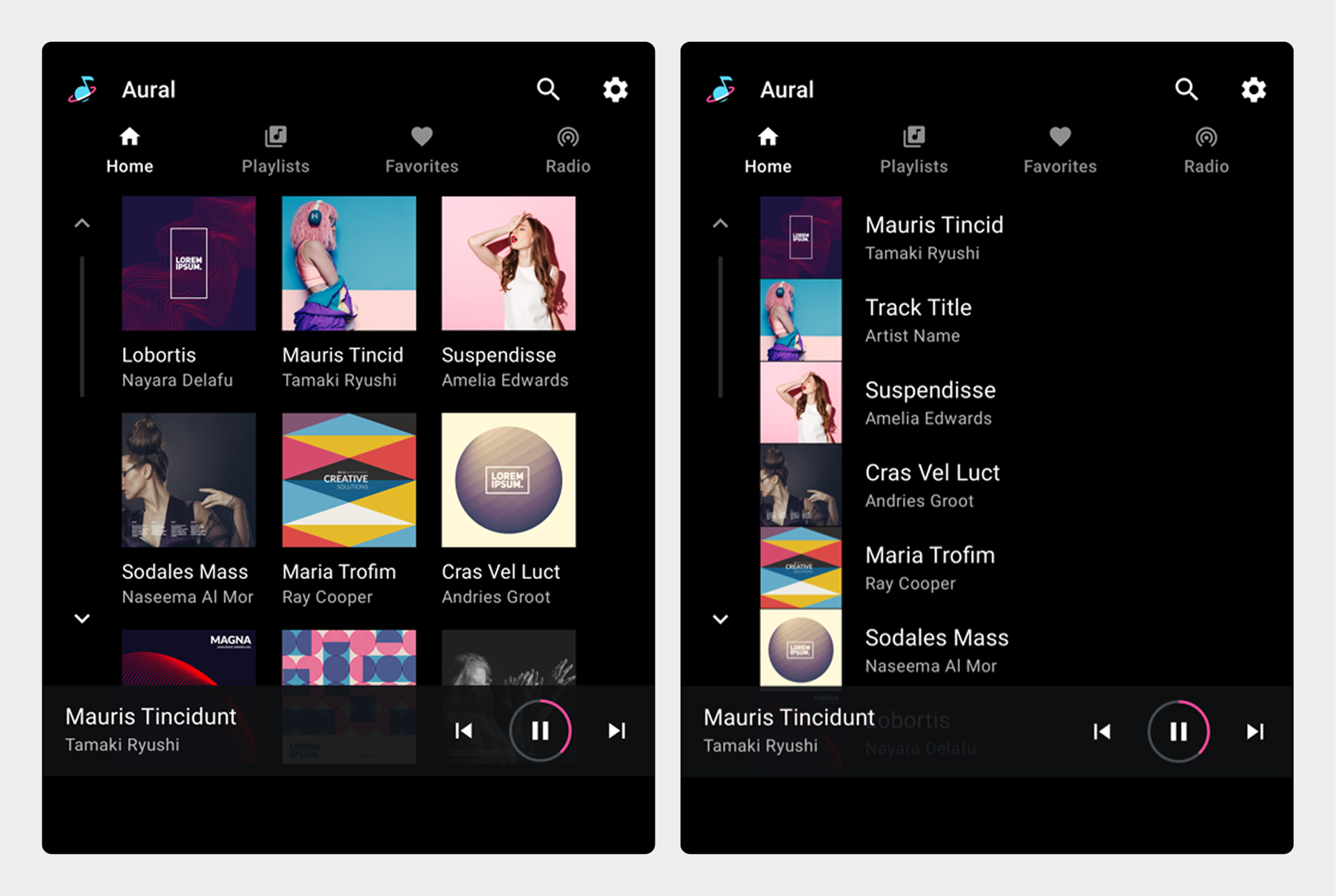
- Browseable content space – Displays content in either a grid view (shown here) or a list view
- Playback controls – The minimized control bar shown here includes basic media metadata and playback controls, and it also provides access to a playback overlay with more controls
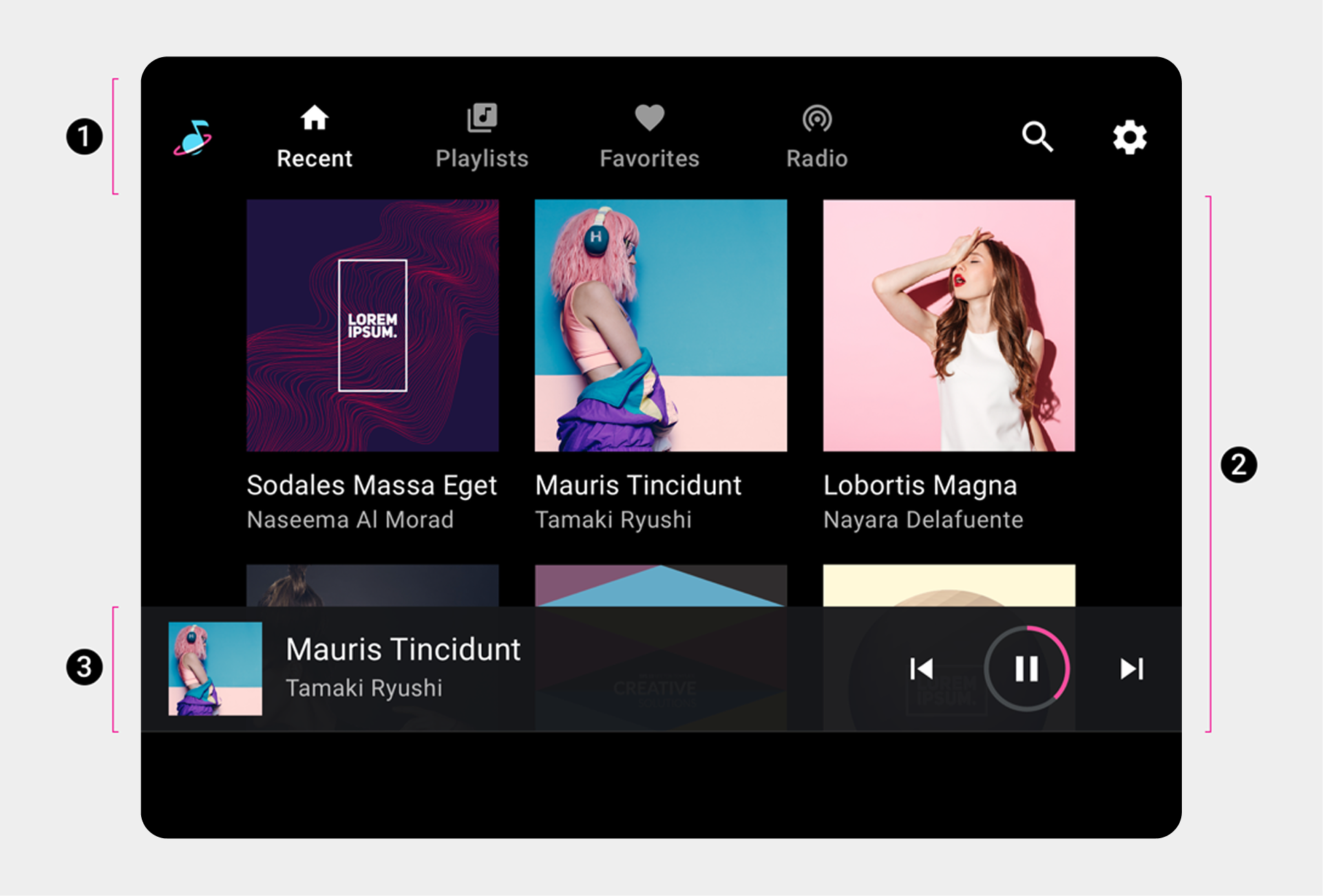
2. Browseable content space
3. Playback controls (shown here on minimized control bar).
This sample layout shows just one possible arrangement of these elements. For example, you can stack primary navigation and app controls rather than keeping them in a single horizontal bar, depending on the screen dimensions. The navigation hierarchy is described in more detail in the sections that follow.
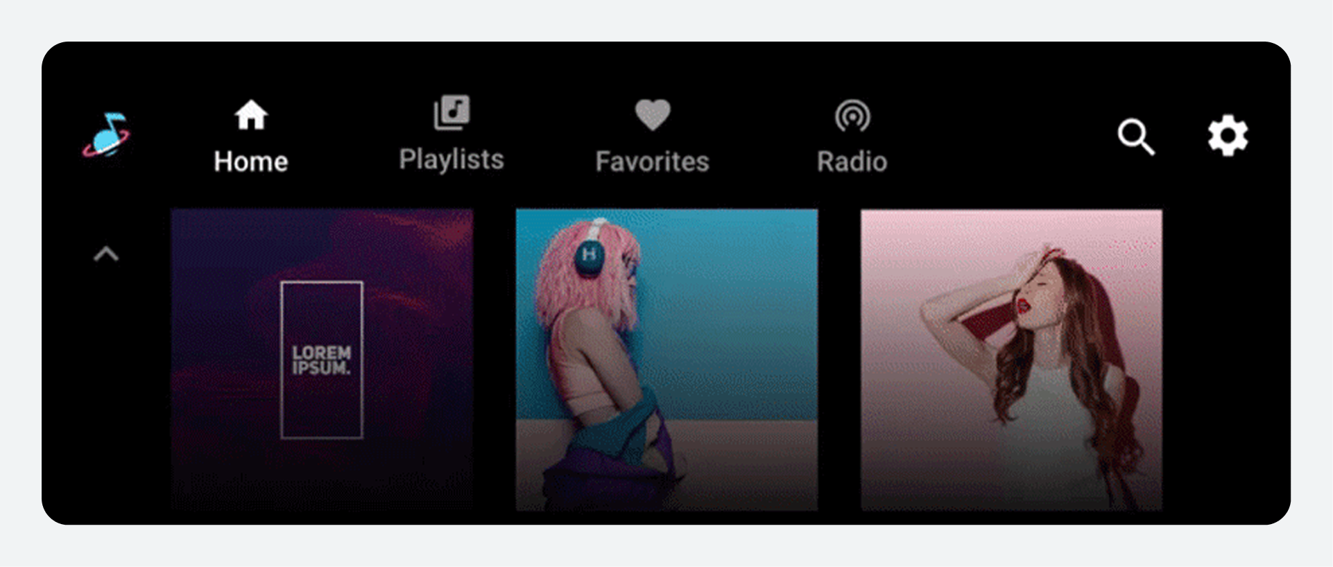
Primary navigation
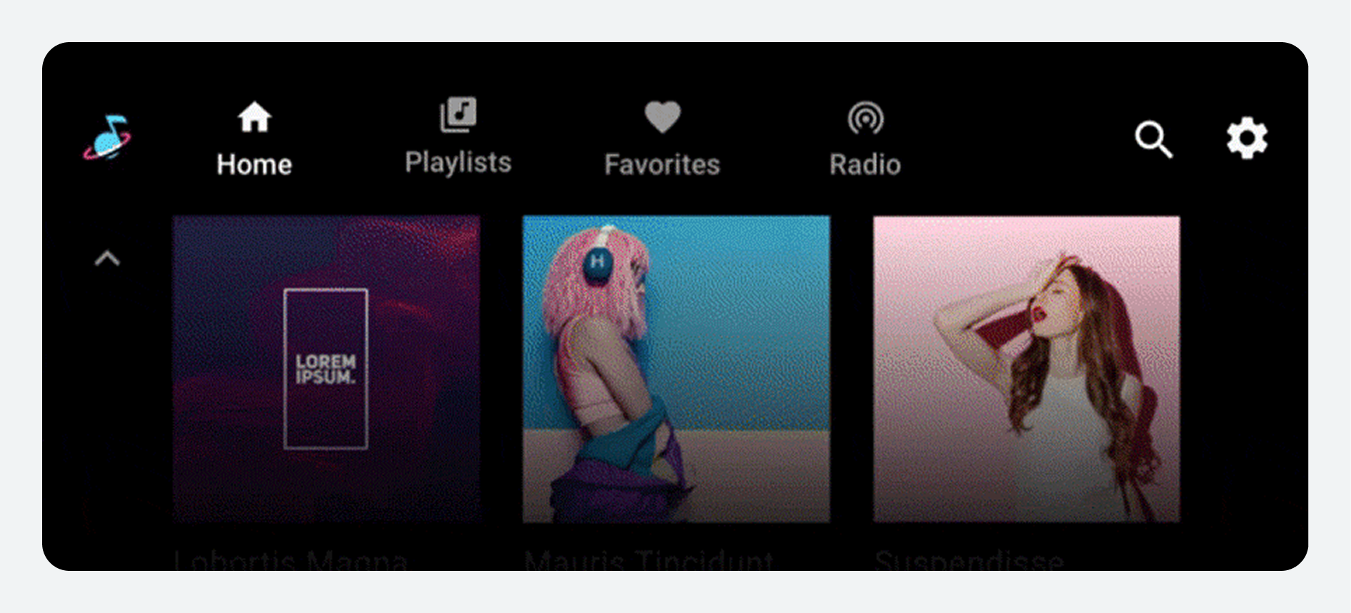
The primary navigation in the app bar consists of exposed tabs (except in rare cases where the screen is too small).
This example shows a typical tab arrangement:

Users can select tabs such as Home and Playlists on the app bar to navigate to these top-level views of media content. |

Selecting a tab on the app bar replaces the current view with a different top-level app view. |
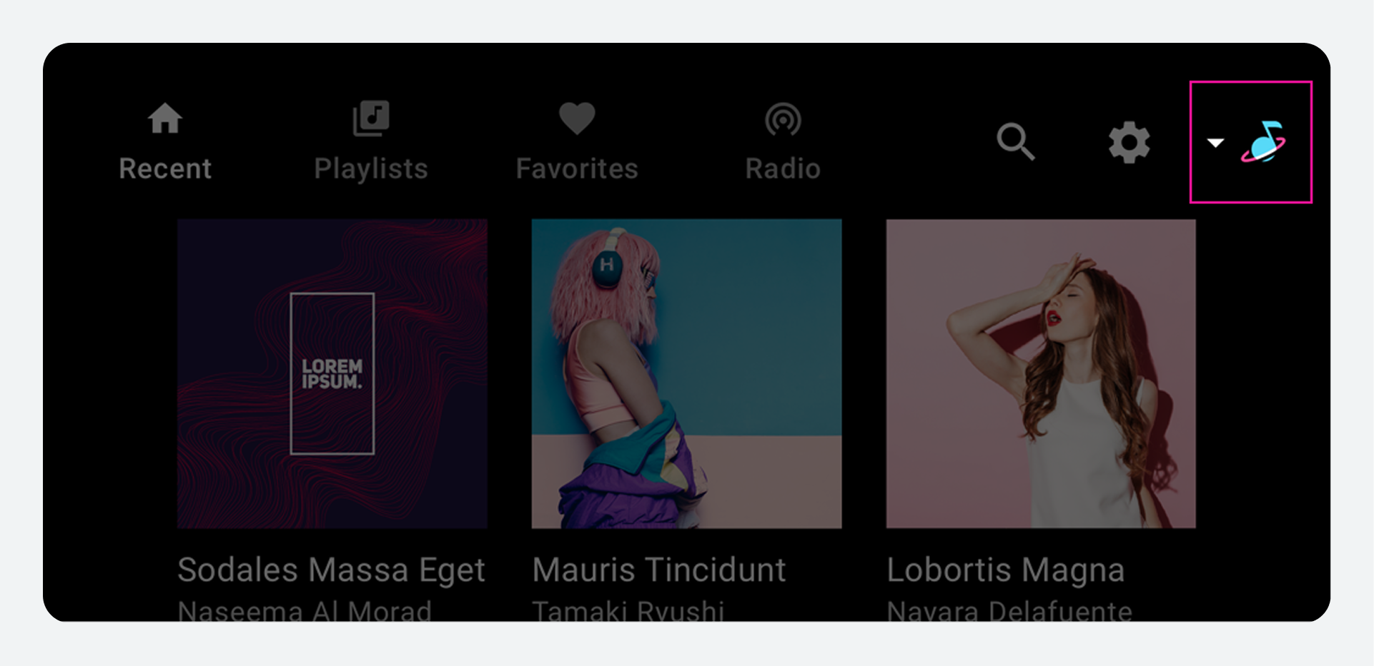
App controls
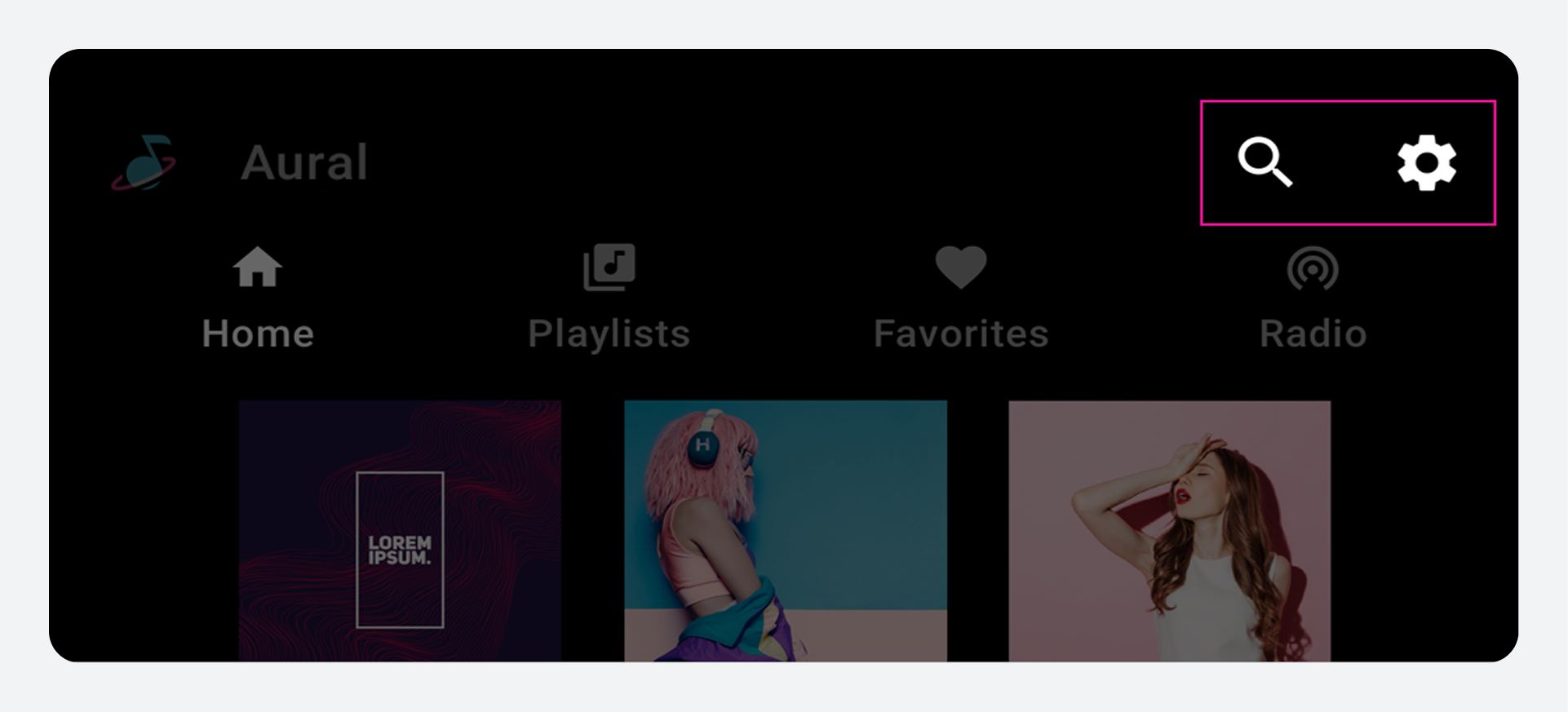
App controls (shown at upper right in the example below) occupy the portion of the app bar not used for branding or primary navigation. They provide access to in-app search and settings functions for the current media app.
Selecting an app control opens an overlay. For example, the Settings affordance shown here opens an overlay that displays the Settings interface. When users close the overlay, they return to their previous location in the app.
Selecting the Settings affordance on the app bar opens an overlay that allows users to access app settings. |
When an app control is selected, it opens an overlay on top of the browsable content, and the app bar changes to an app header. |
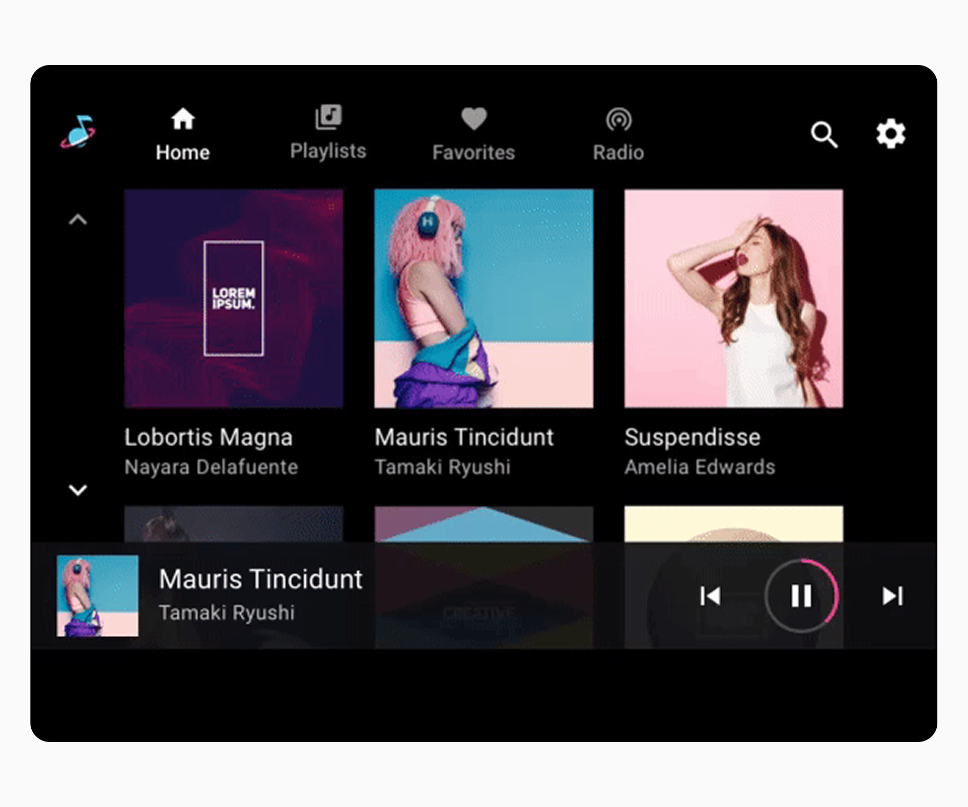
Browsable content space
Within the browsable content space, users can scroll through content and navigate through z-space into individual items, down consecutive levels of hierarchy.
Because navigating through multiple levels increases the driver's cognitive load, Google recommends keeping the information architecture relatively flat, with as few levels as possible.

The top level of browsable content lets users choose from a grid (as shown here) or list. |
Making a selection from browsable content opens the next level down with more detail. |
Playback controls
Playback controls in media apps can appear in either of two forms, depending on the circumstances:
- Minimized control bar (available across views)
- Playback view (overlay with full control bar)
These two forms alternate along the bottom of the screen in the animated example that follows.
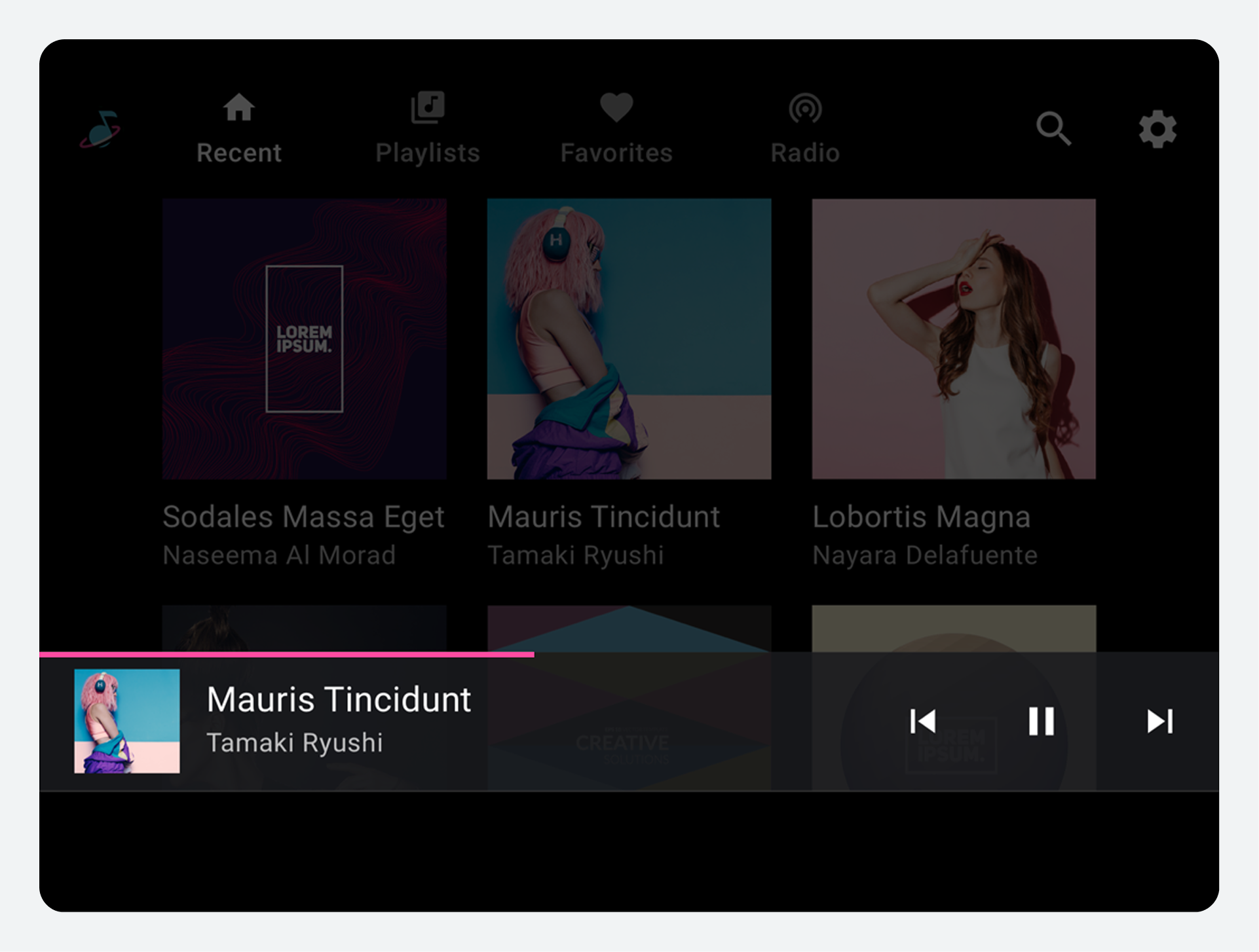
Minimized control bar
The minimized control bar floats at the highest level of the browsable content space, above the content. It provides information about what's currently playing, along with basic affordances for user control of playback.
When content begins playing, the minimized control bar remains available while a user is browsing media content. It persists until a new media app is selected or until the user taps the minimized control bar to display the playback view.
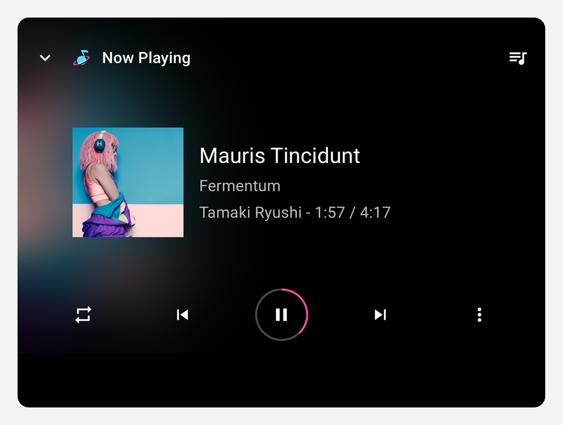
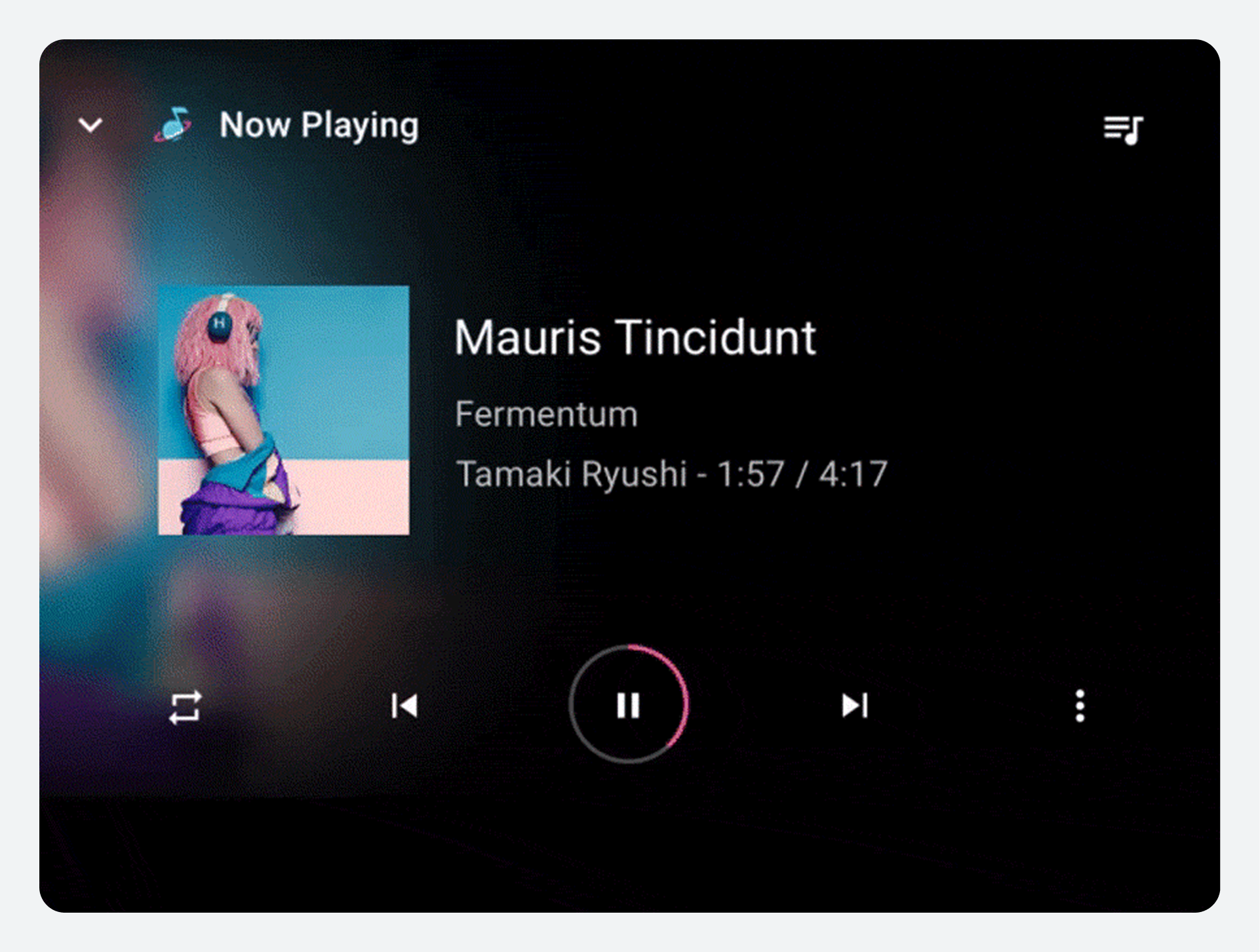
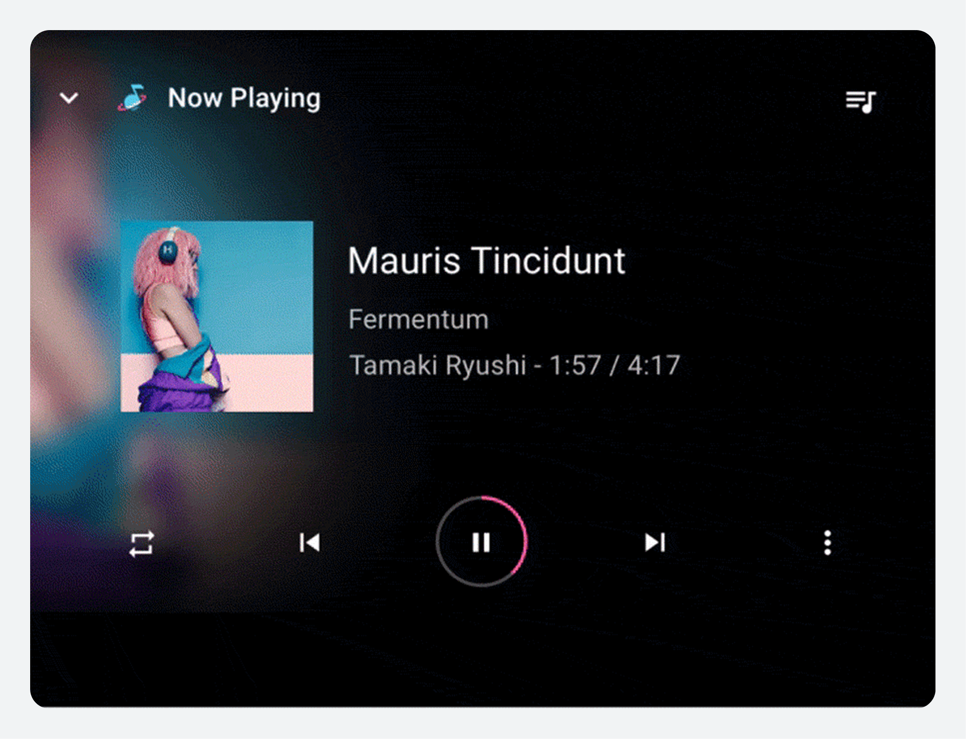
Playback view
The full control bar is available only in playback view, and it also floats above the content. In addition to the affordances available from the minimized control bar, the full control bar can provide more extensive controls defined by each media app.
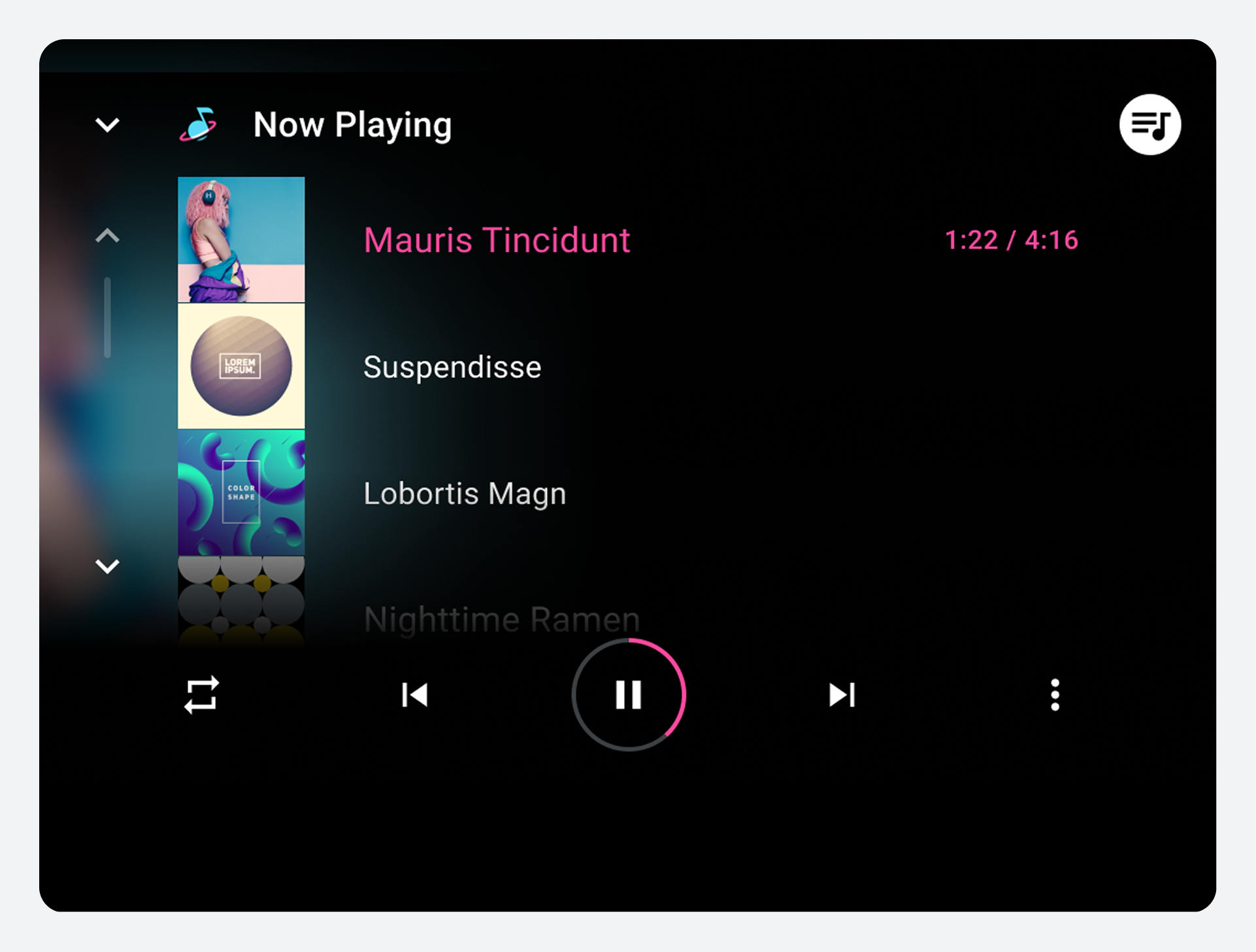
Selecting the minimized control bar anywhere outside of the touch targets for its controls expands it to a full-screen playback overlay (the playback view), as shown here. |
 |
Interaction model
AAOS presents media content on a car's screen and allows users to browse and play content in a vehicle-optimized environment.
How media apps work in cars
AAOS includes a set of APIs that handle playback and browsing experiences for media apps in cars. These APIs allow app developers to take advantage of a standard template for media apps, including:
- Navigation and playback controls
- Browseable views of media content
- App controls for in-app search and settings
This template supports the in-vehicle infotainment (IVI) experience in two ways:
- Car makers can customize the look and feel of the interface to fit their cars and their brand.
- App developers can connect their content to the interface to provide a consistent experience that reflects their app's brand across multiple cars and manufacturers.
Google is designing the basic user experience for media apps based on safety considerations and principles such as those discussed in Design foundations and Design principles. You can adapt aspects of this user experience for your own infotainment system without disrupting the functionality of apps that are built for AAOS.
For example, while one car maker's media apps might look and feel different from another's, a media app user will interact with that app's familiar controls no matter what type of car they're driving. At the same time, in a single type of car, switching from one media app to another will not change the basic browsing and playback operations involved in using media apps in that car.
Navigate media apps
This section describes how a media app's top-level app navigation works.
Users navigate among top-level content views in a media app using the app bar, which can include the following navigational elements:
- Primary navigation tabs (or variants)
- App selector (optional)
The app bar can also include an app icon and app controls, which are discussed in App branding and Sign-in, settings, and search.
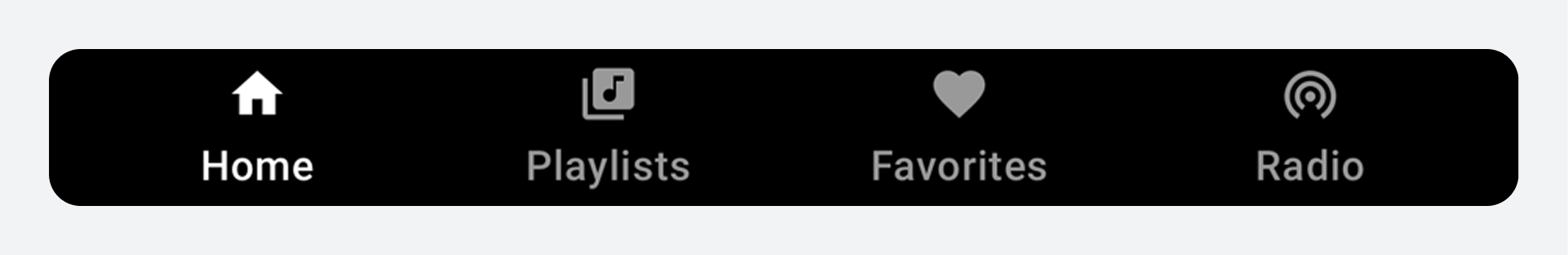
Primary navigation tabs
Primary navigation for content views within a media app generally consists of up to 4 tabs in an app bar (unless the screen is extremely small and lacks room to display tabs). These tabs let users move laterally between content views at the top level of the app hierarchy.
When a user selects a tab, the destination reflects the user's previous interaction with that view of the content. For example, if a tab's content was previously scrolled during the same media app session, the scroll position will be retained when the user returns to that tab.
Primary navigation variants
Each primary navigation item is typically represented with tabs that include both an icon and label. Including both reduces the cognitive load for drivers, because icons improve glanceability and labels clarify the meaning.
However, you can use alternate navigation strategies in some situations:
- Labels only: If the screen is not tall enough to accommodate a reasonable amount of content as well as tabs that include both icons and labels
- Drawer: If the screen is not wide enough for tabs
- No tabs: If there is only one primary navigation option
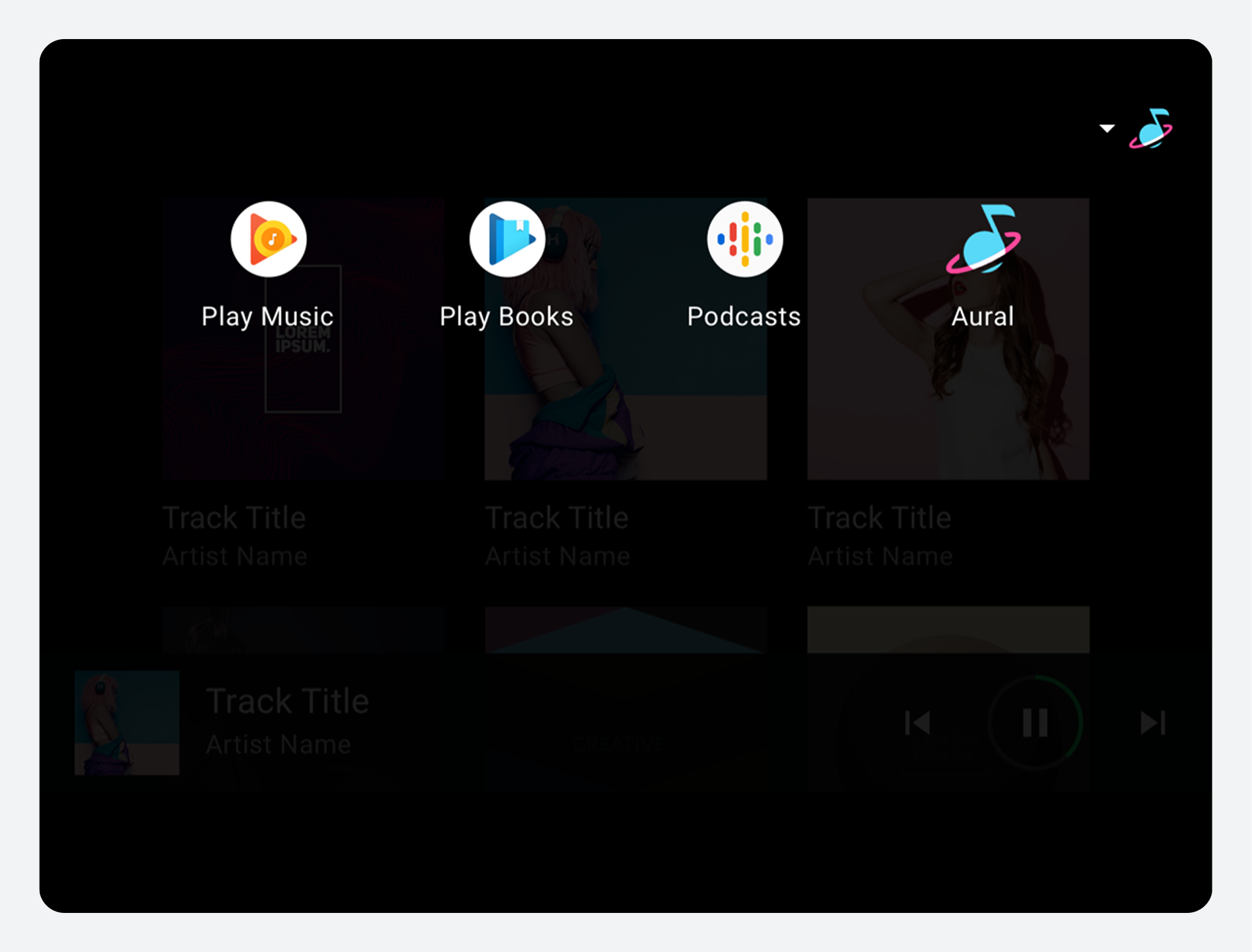
App selector
The app selector provides quick access to other media apps. You can decide whether to provide an app selector. For example, you may prefer to rely solely on a list of all available apps as the mechanism for switching media apps.

When invoked, the app selector provides access to other media apps. When a user selects a different app, that app is displayed.
App bar positioning
You can determine the location for the app bar across all AAOS templates, including the media template. As long as it's always in the same place, the app bar can appear at the top or bottom of the screen or on one side. It's also possible to stack the tabs and app controls within the app bar.
To minimize cognitive load and ensure a reliable user experience, the app bar and its affordances must always appear in the same location across the entire infotainment system.
Browse content details
This section describes how content browsing works in media apps, including how users navigate to lower-level views with more detail.
The process of browsing content in a media app involves:
- Viewing grids or lists of content
- Selecting browsable content items (that is, items that represent a collection of items, as opposed to being playable) to navigate to more detailed views of those items
The detailed view of a content item exists on a lower level of the content space, also formatted as a grid or list. Users can navigate upward from lower levels using a Back affordance in the app header.
Grid and list views of content
Media content can be presented in a grid view, a list view, or a combination of both in the same content space. Content can be organized into categories separated by subheaders. Users browse through the grids or lists by scrolling vertically.
Navigation to levels with more detail
As users browse within the content space, they can select a browsable content item (such as an album or playlist) to navigate to a more detailed view of that item (songs on the album, or individual items on the playlist). When a user begins to move deeper into the content space in this way, an app header appears at the top of the screen, including an affordance that allows the user to return to the previous level.
As users scroll through a grid or list of content, an app bar (or app header) at the top of the screen remains fixed in place, with the content scrolling behind it.
Play media
This section describes how playback works for media apps.
Users can control media playback from either of the following:
- Playback view (full screen, full set of controls)
- Minimized control bar (minimal controls, available across views)
Playback view
To begin playback, a user selects a playable item in the content space, such as an album or song, and the playback view takes over the entire content space. The playback view displays metadata and playback controls for the selected content. Users can control playback using these controls and also with gestures.
Playback controls
Playback controls are displayed in the control bar, which can be expanded if there are more than 5 controls (see "Playback control locations," below). If the app implements a queue, the app header includes an affordance to access the queue.
Playback control locations
To ensure consistent usage across media services, the bottom row of controls (or the only row, if the control bar is unexpanded) should present the controls in the order shown in the following figure. The top row, which appears only when the control bar is expanded, is reserved for up to t=five custom actions.
If an app doesn't use Previous or Next buttons, these buttons may also be replaced with custom actions.
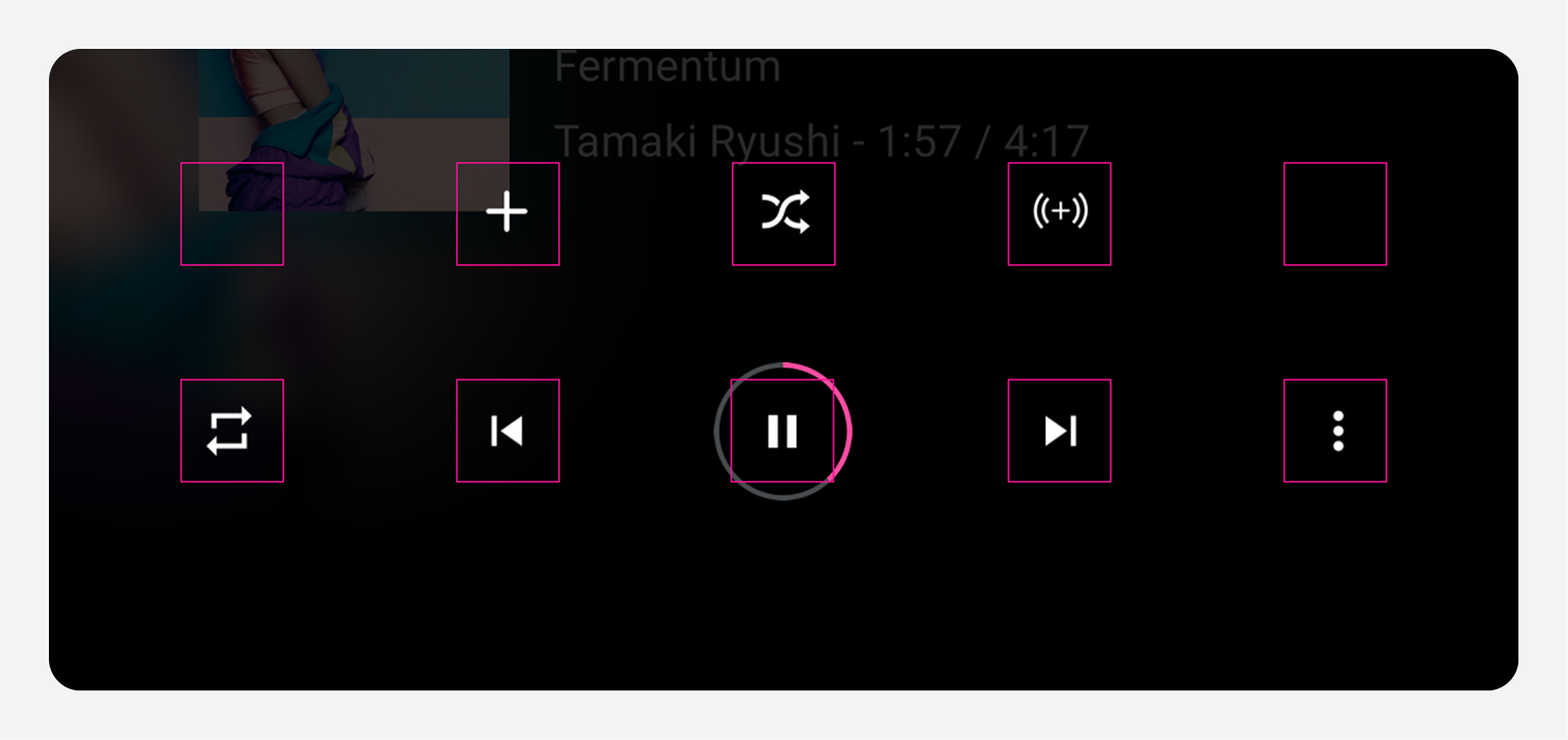
| Position | Button |
|---|---|
Far left |
Custom action |
Left of center |
Previous or custom action |
Center |
Play / Pause |
Right of center |
Next or custom action |
Far right |
Overflow affordance (if there are more than 5 controls) or custom action |
Gestures
In addition to using the controls in Playback view, users can use a gesture to minimize the view.
Minimized control bar
If the user leaves the playback view while content is still playing, the control bar available in the playback view collapses into the minimized control bar, which provides information about the currently playing content, plus basic controls such as Play and Pause. The minimized control bar allows the user to browse available media while the current song or other content continues playing.
Queue
If a media app implements a queue, the playback view's app header includes a queue affordance. Selecting the affordance displays a scrollable, chronologically ordered list of currently playing and upcoming content. Some media apps may also display previously played content in the queue.
At a minimum, the queue displays a title for each queued item. App developers can also provide a thumbnail for each. In addition, they can provide an icon to indicate the currently playing item, which can also be indicated by showing the elapsed time for that item. However, car makers can choose whether to show or hide any of these items: the thumbnail, the icon, or the elapsed time.
Users can scroll the list and select any item in the queue to play it immediately in the playback view. To return to the playback view without selecting an item to play, users can select either the queue or back affordance.
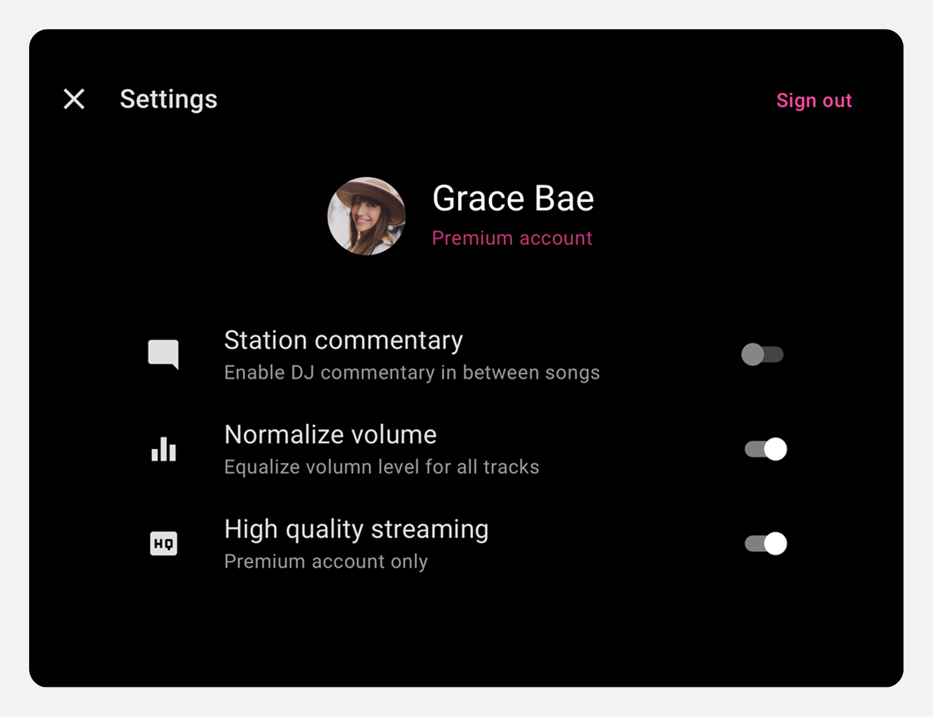
Sign-in, settings, and search
This section describes how sign-in and app controls for search and settings work in media apps.
Users access app settings and in-app search using the app controls on the app bar or app header. Car makers design the search overlay, and app developers connect their content with Android Automotive OS APIs. App developers design all aspects of the settings overlay and sign-in flow for their apps.
Sign-in
When a user tries to open an app that requires sign-in (typically after installing the app from the Play Store), the user enters the sign-in flow provided by the app developer. If sign-in for an app is optional, it can be included as one of the app settings, so users can get to it that way.
The sign-in flow may involve one or more of the following:
- Google sign-in: Letting users sign in using their Google account
- Phone sign-in: Displaying a PIN code on the car screen for users to enter on their phones, or vice versa
- Standard sign-in: Having users enter their user names and passwords for the app on the car screen
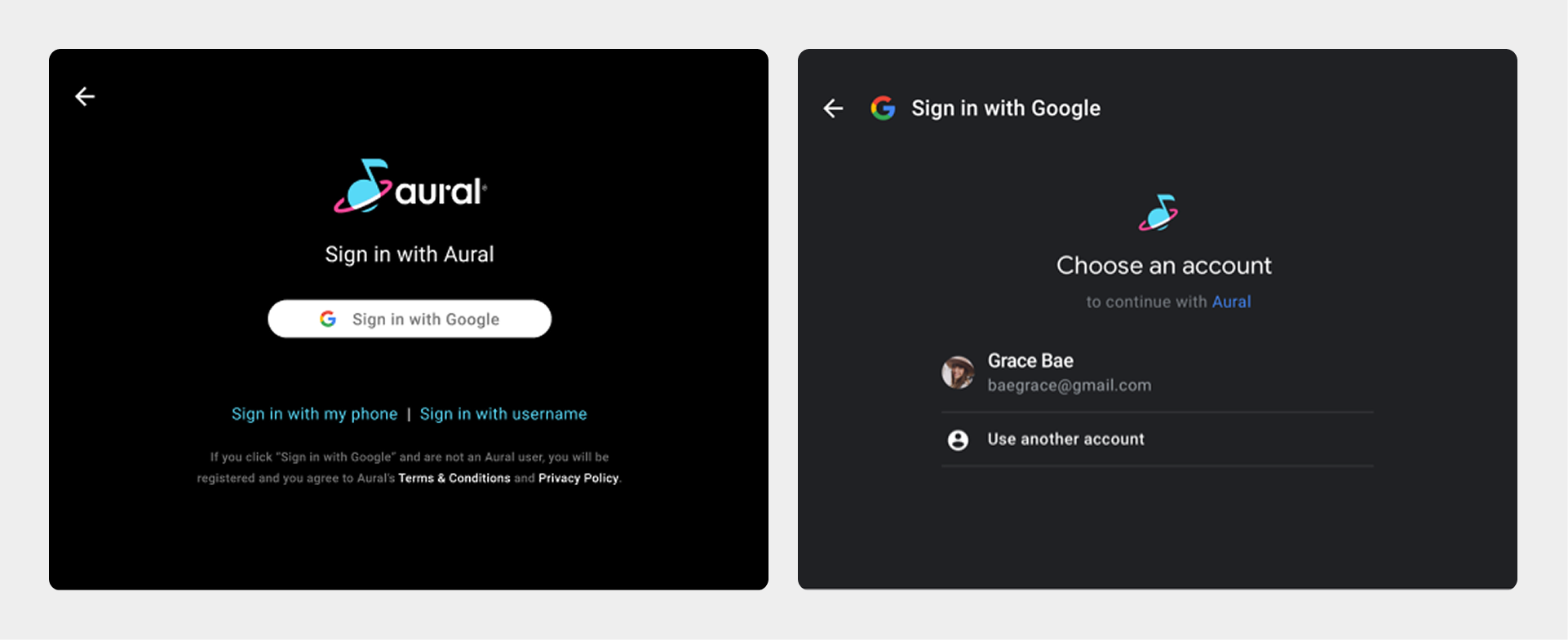
Google sign-in is recommended as the primary sign-in option for apps that support it. With this option, users confirm their existing Google Account, as shown in the figure.
For more examples of sign-in flows and guidelines for creating them, visit Sign-in.
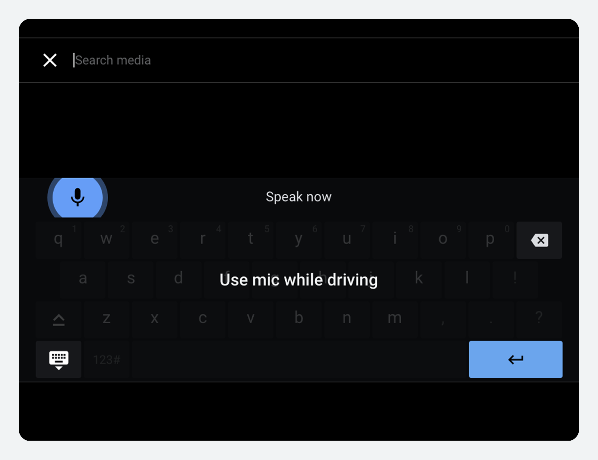
App controls (search and settings)
App controls consist of in-app search and app settings for the media app. App developers may choose to implement either or both.
|
|
Division of roles
The table below summarizes the design roles of car makers and app developers in ensuring a unified media app experience.
| Aspect of the media experience | Car maker's design role | App developer's design role |
|---|---|---|
Navigating media apps |
Decide where the app bar goes and support app navigation and controls that can appear in the app bar |
Decide which top-level content views to represent in the app bar's tabs and provide icons and labeling as needed Visit Plan navigation tabs |
Browsing content details |
Determine size and content of grid or list items and implement app header at lower levels of content |
Determine format (grid or list) and organization for browsable media content at each level Visit Plan browsing views |
Playing media |
Implement playback view and minimized control bar with appropriate media metadata and playback controls, including controls for any custom actions in the app. Provide a queue affordance in playback view and styling for the queue. |
Decide whether to implement custom actions on the control bar, and provide icons for them. Decide whether to implement a queue and whether to provide an indicator for the currently playing track. |
Sign-in, settings, and search |
Provide affordances for search and settings on the app bar bar, design search keyboards, and connect users to sign-in screens as needed |
Provide sign-in flow (adapted from sample code) and settings screens if needed Visit Sign-in and Design sign-in and settings |
Brand attribution |
Display the app icon on all content screens and choose where to apply the third-party app color as an accent |
Provide app icon and specify accent color Visit Display app branding |
App checklist
Use this list to make sure you have provided all of the design elements needed for presenting your app within the media template for AAOS.
| Design elements | Related design task | Related technical task and sample code |
|---|---|---|
Navigational elements:
|
||
Browsing-view elements:
|
||
Playback elements:
|
||
Sign-in elements:
|
||
Settings elements:
|
||
Branding elements:
|
Guidelines for custom screens
For most aspects of media apps used in AAOS, you don't need to design custom screens. The areas of exception are settings and sign-in. If you want users to access app settings, you need to design settings screens. Also, if your app requires sign-in, you need to provide a sign-in flow, which you can customize from the sample code in the Universal Android Music Player.
These general style guidelines apply to both custom settings screens and customized sign-in screens. They help you to optimize your designs to be viewed on a car screen, while parked, at any time of day or night.
For additional guidelines specific to settings and sign-in, refer to App settings.
| Requirement level | Guidelines |
|---|---|
MUST |
App developers must:
|
SHOULD |
App developers should:
|
MAY |
App developers may:
|
Rationale
Screens designed directly by media app developers should:
- Support standard media app navigation patterns and design conventions.
- Reflect design principles and visual foundations for AAOS.