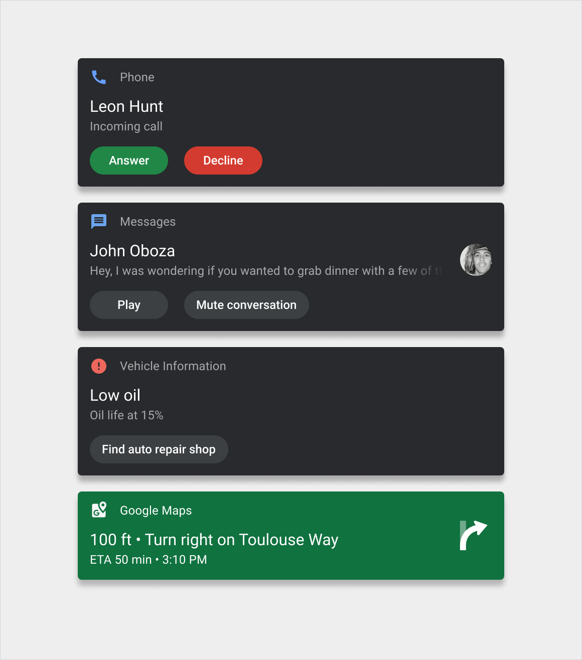
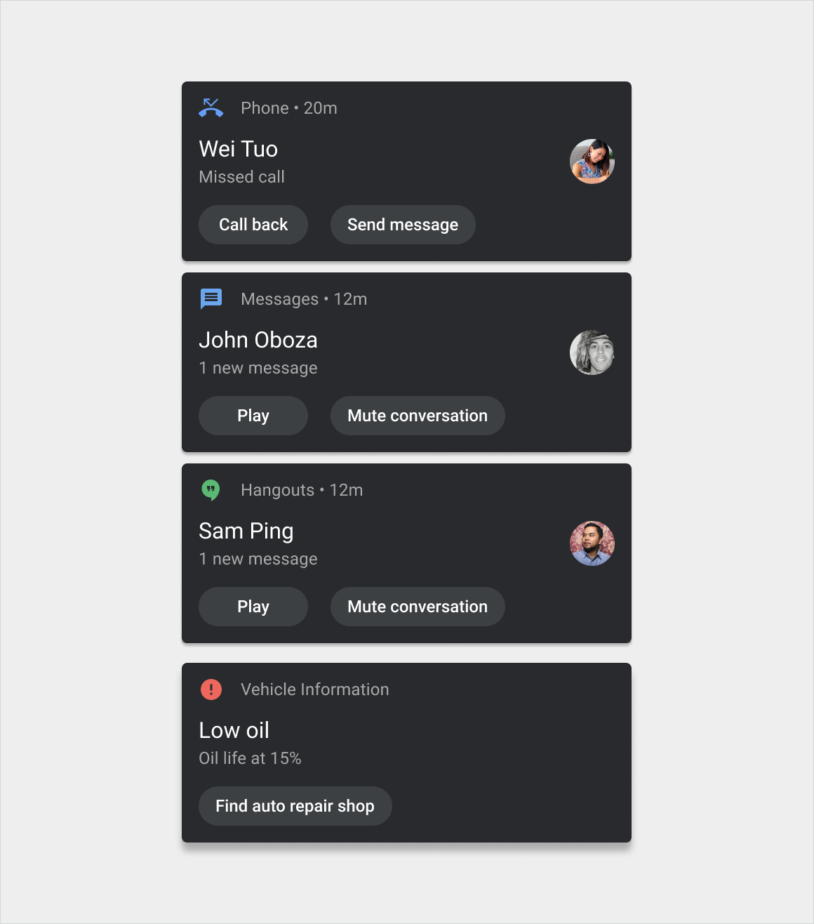
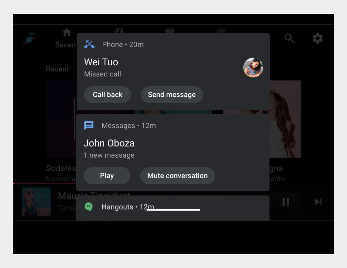
Notification cards communicate small amounts of timely information from the system or from an app.
The design of these cards for Android Automotive OS is intended to minimize distraction for drivers. The cards come in three basic versions:
- Heads-up notification (HUN) card:Used for a notification that appears briefly over the current screen
- Notification Center card:Used for notifications listed in the Notification Center
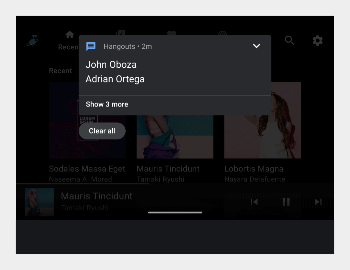
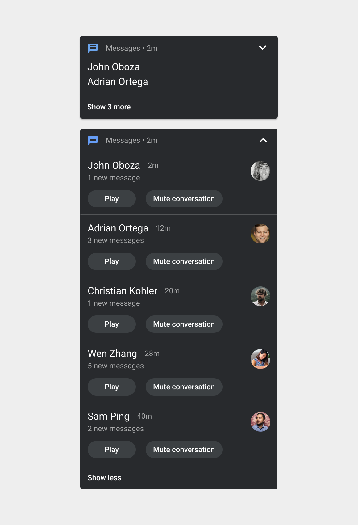
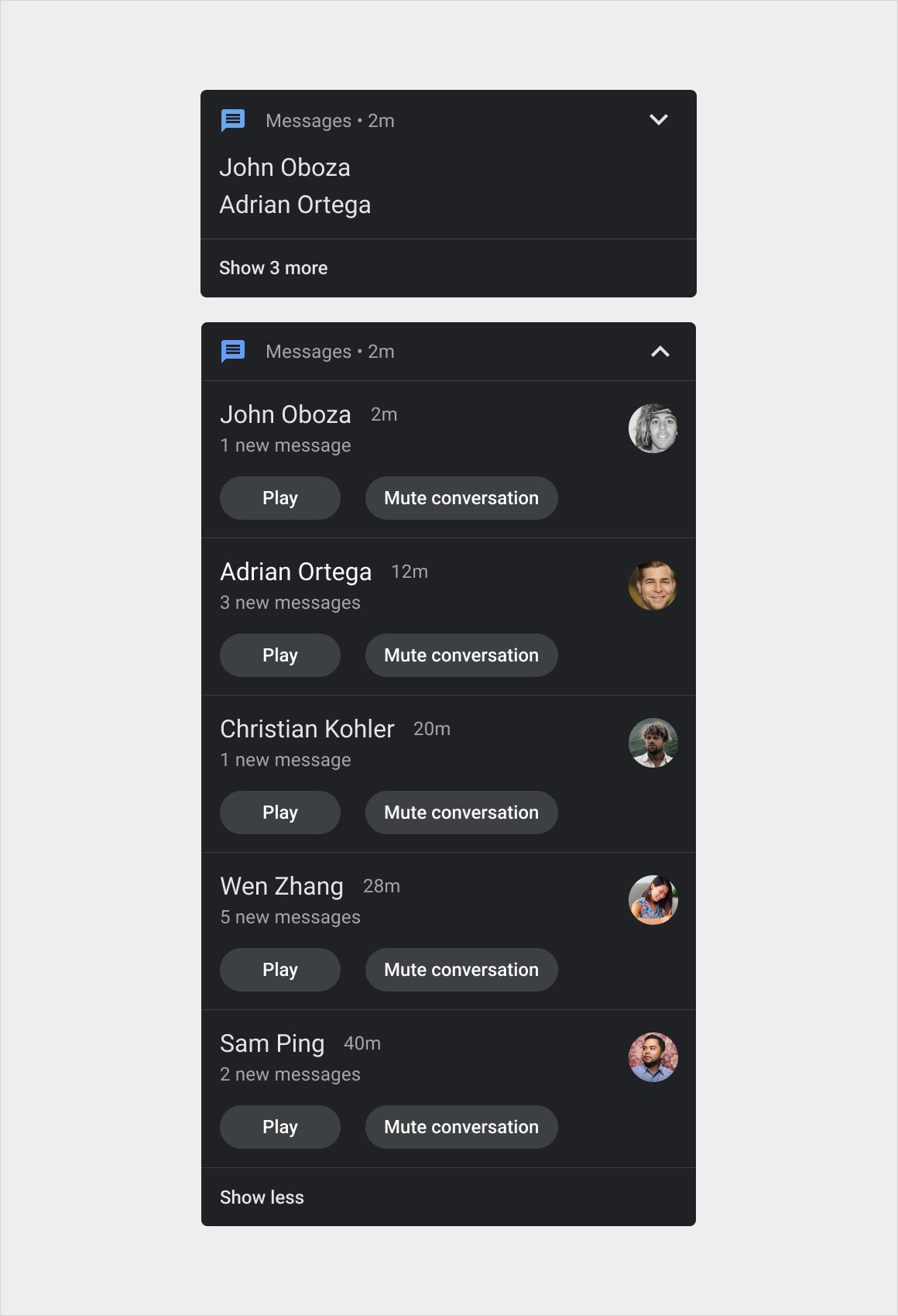
- Grouped-notification card:Combines multiple Notification Center cards in one card
Within these versions, designs can also vary slightly depending on the category of the message. For example, call notifications have different buttons and icons than navigation notifications.
Anatomy
The notification card is a flexible component that can include a variety of elements. It has three main versions:
- HUN card:This version is wider than the Notification Center card and appears on top of the current screen until dismissed
- Notification Center card:This version is narrower than the HUN card and appears with other such cards in the Notification Center, in a vertical list
- Grouped-notification card:This version of the Notification Center card combines multiple related notifications in one card, with controls for expanding to show the individual notifications
Variants of these versions by message type are shown in Styles.
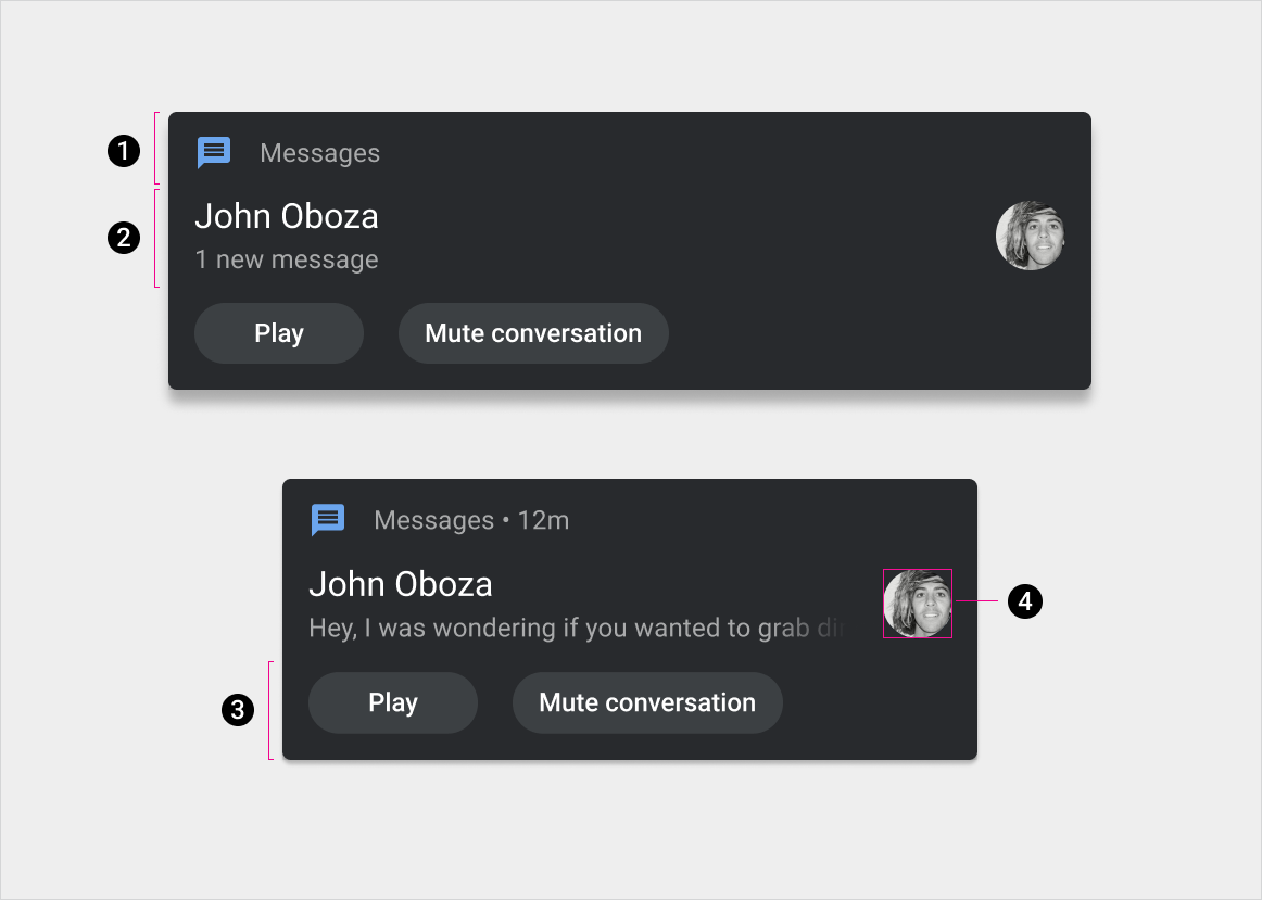
1. Header
2. Content (with and without optional message preview, which can be hidden when the car is driving)
3. Actions
4. Large icon
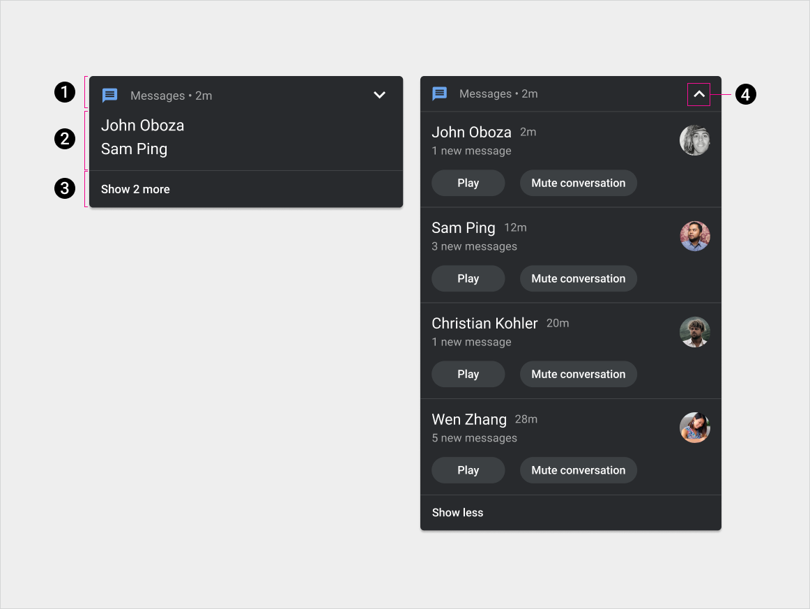
1. Header
2. Content
3. Expand/collapse action
4. Expand/collapse indicator
Specs – HUN card
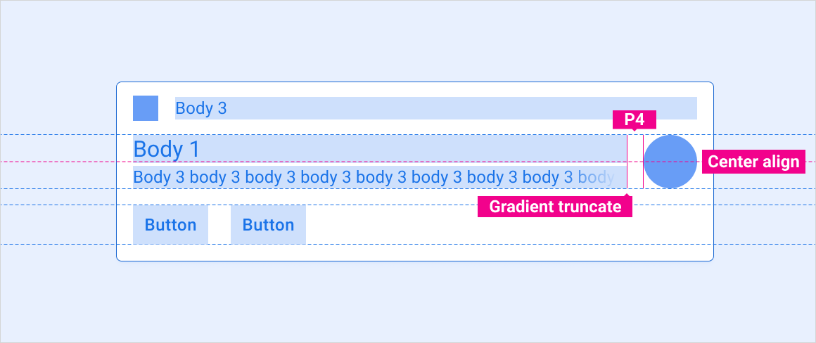
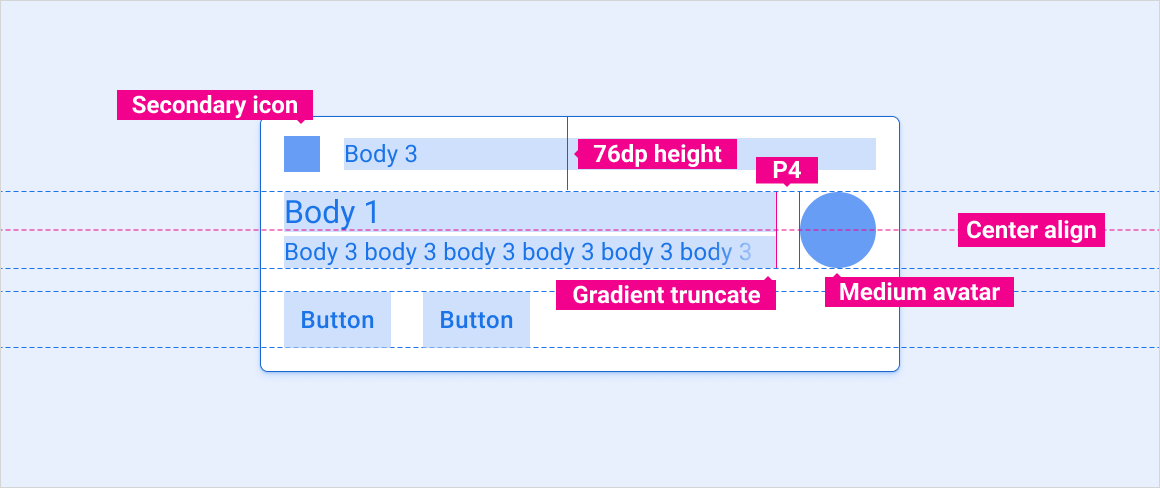
Standard HUN
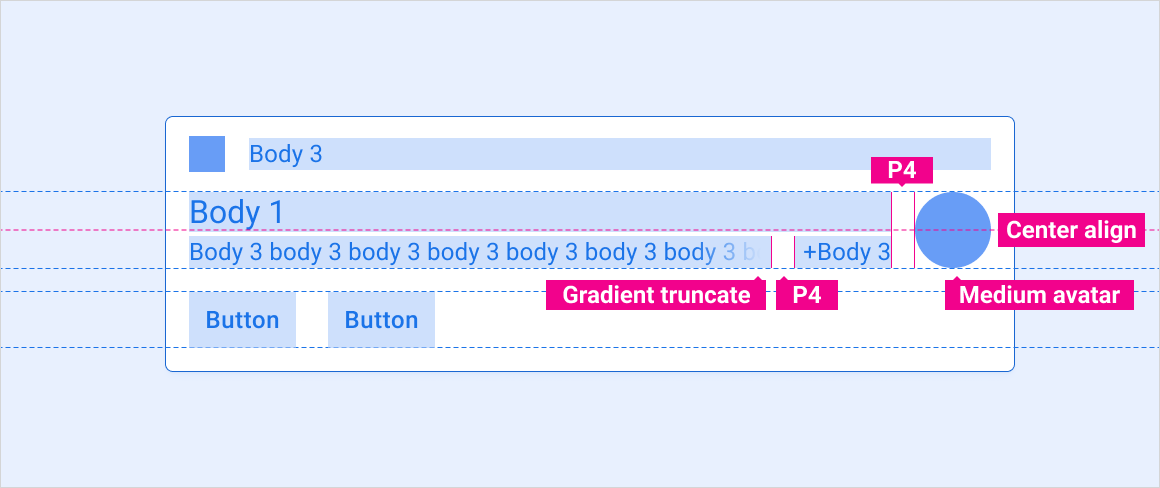
HUN with avatar
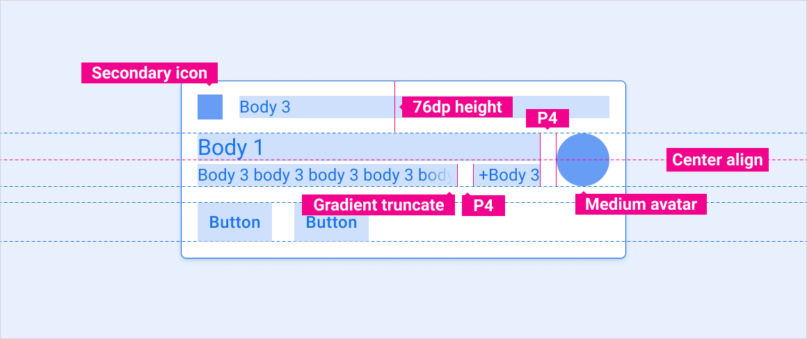
Message HUN with preview
Message HUN with multiple messages
Large-image HUN
Specs – Notification Center card
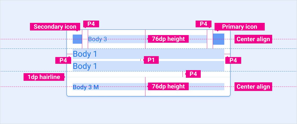
Standard notification
Message notification with preview
Message notification with multiple messages
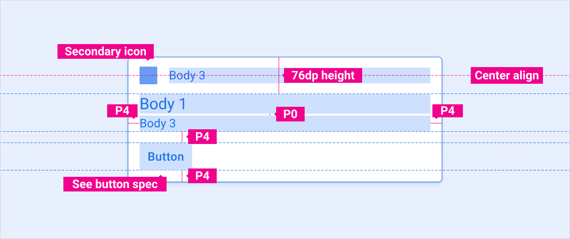
Single action notification
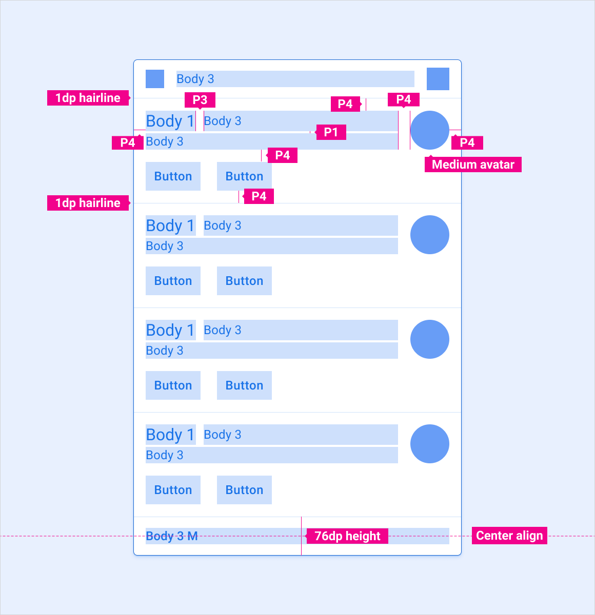
Specs – Grouped-notification card
Grouped notification – Collapsed
Grouped notification – Expanded
Scaling layouts
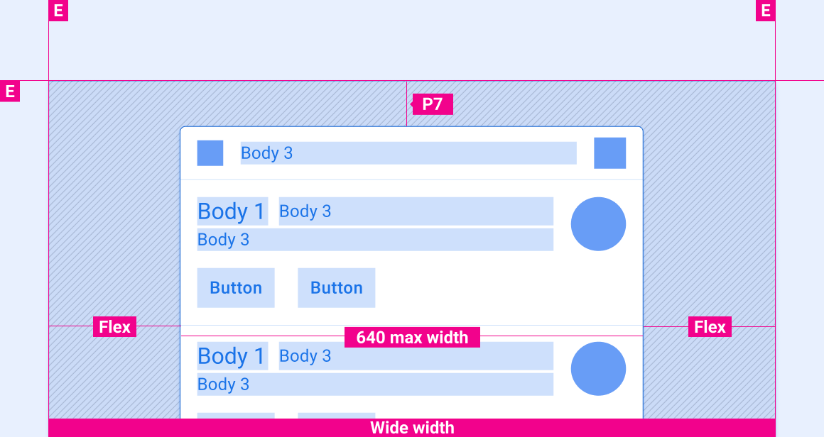
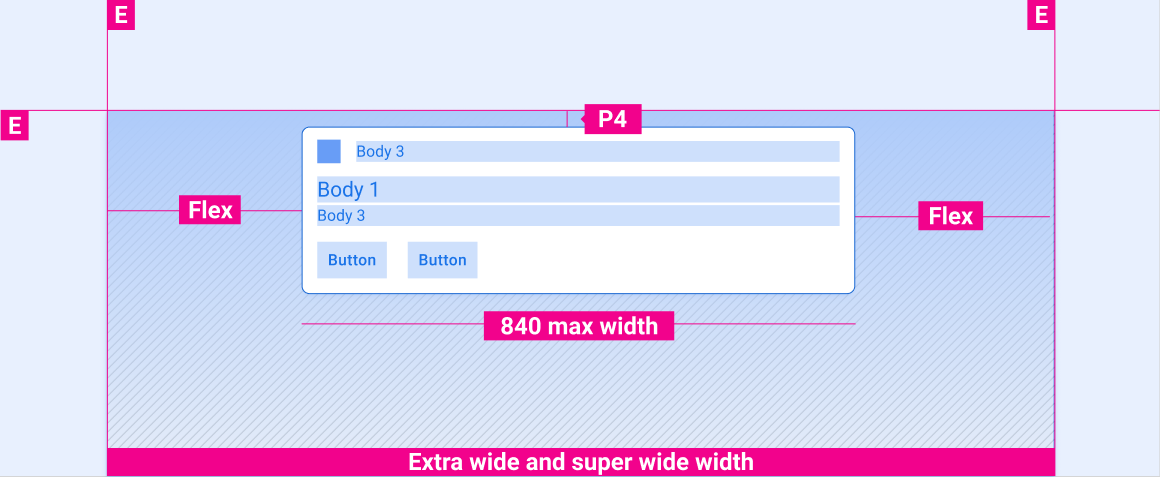
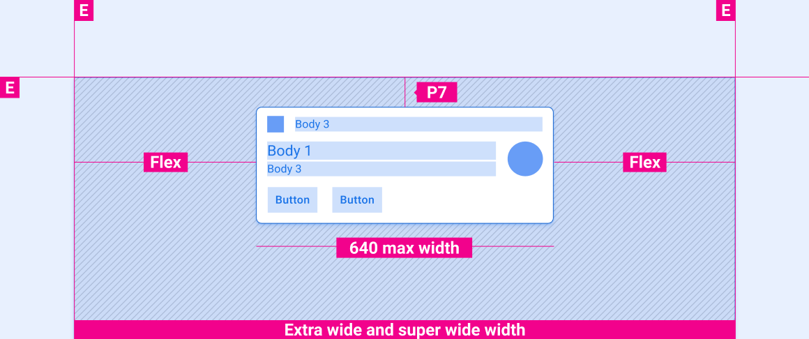
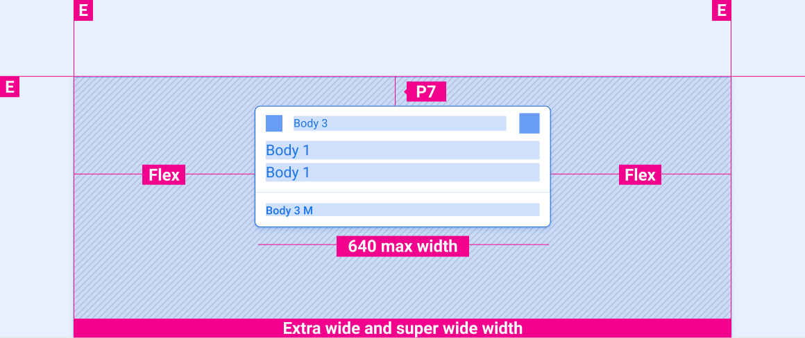
These reference layouts show how to adapt notifications to accommodate screens of various widths and heights. Note that all pixel values are in rendered pixels, before any down-sampling or up-sampling occurs.

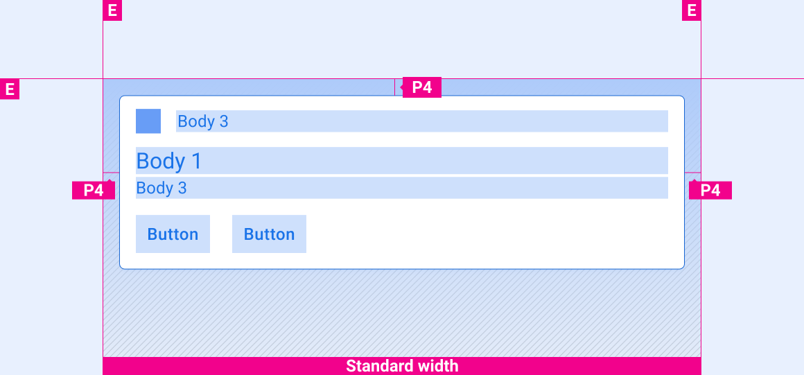
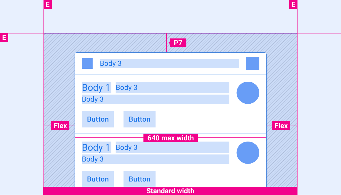
Standard-width screens
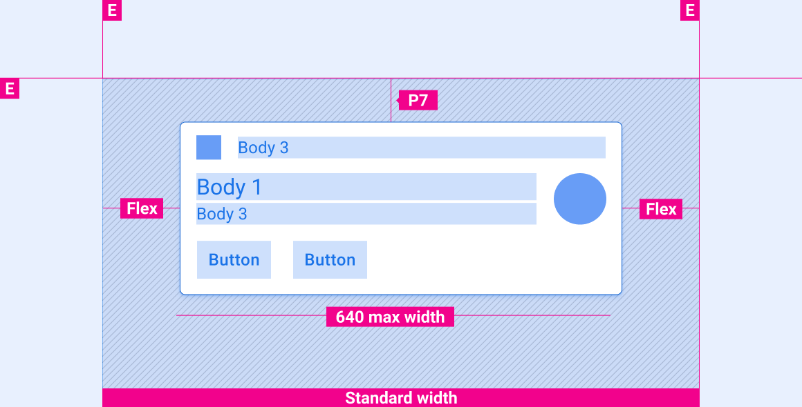
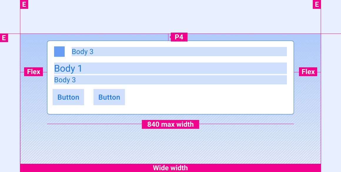
Wide screens
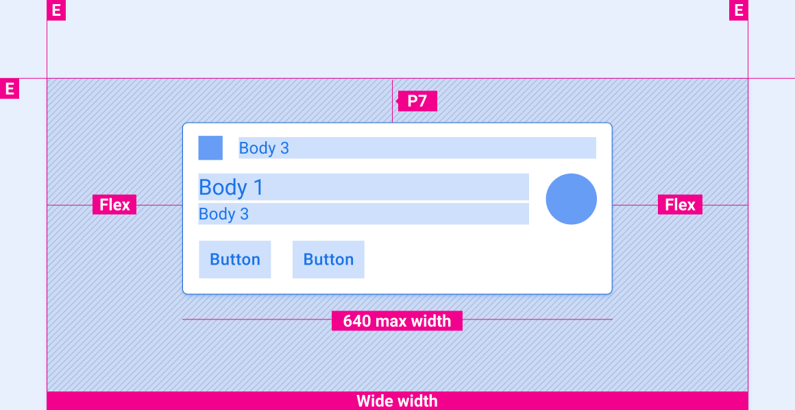
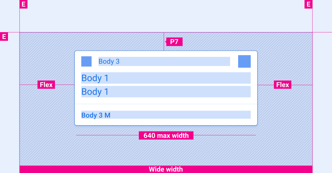
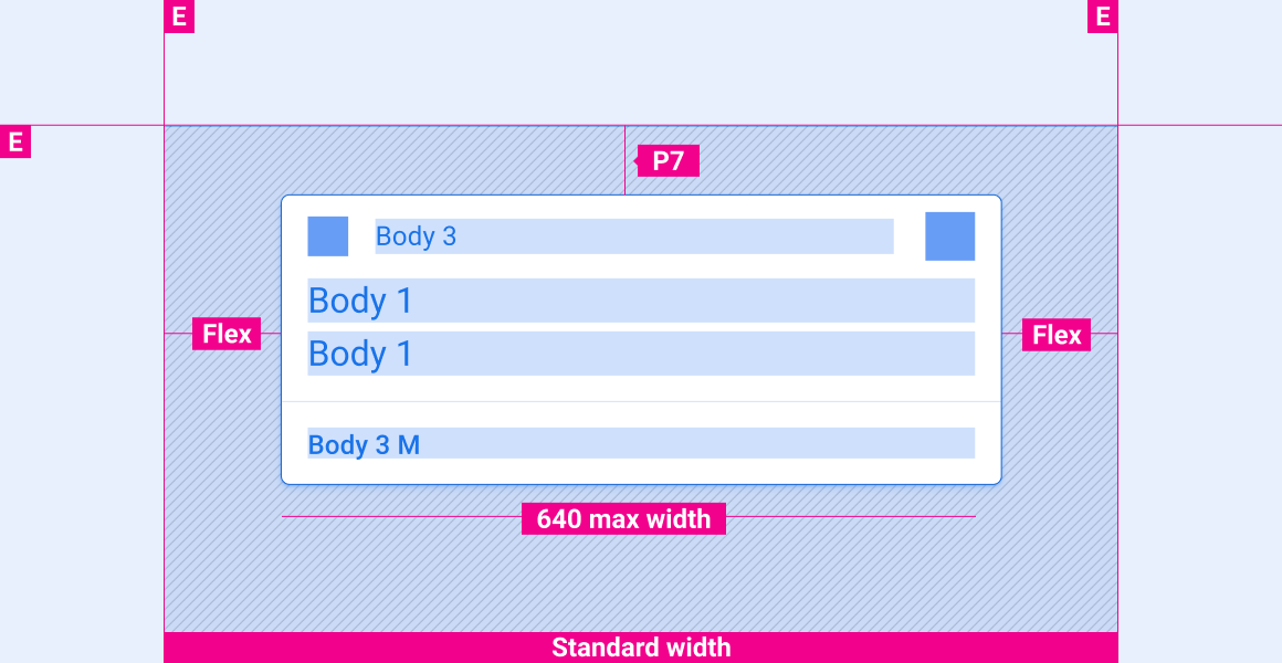
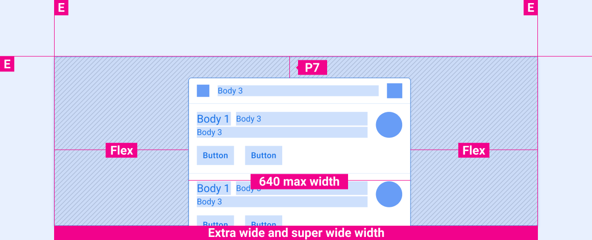
Extra-wide and super-wide screens
Vertical spacing of notifications on screens of various heights
The vertical-spacing specs in this section are for HUN cards only.
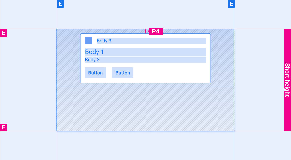
Short screens
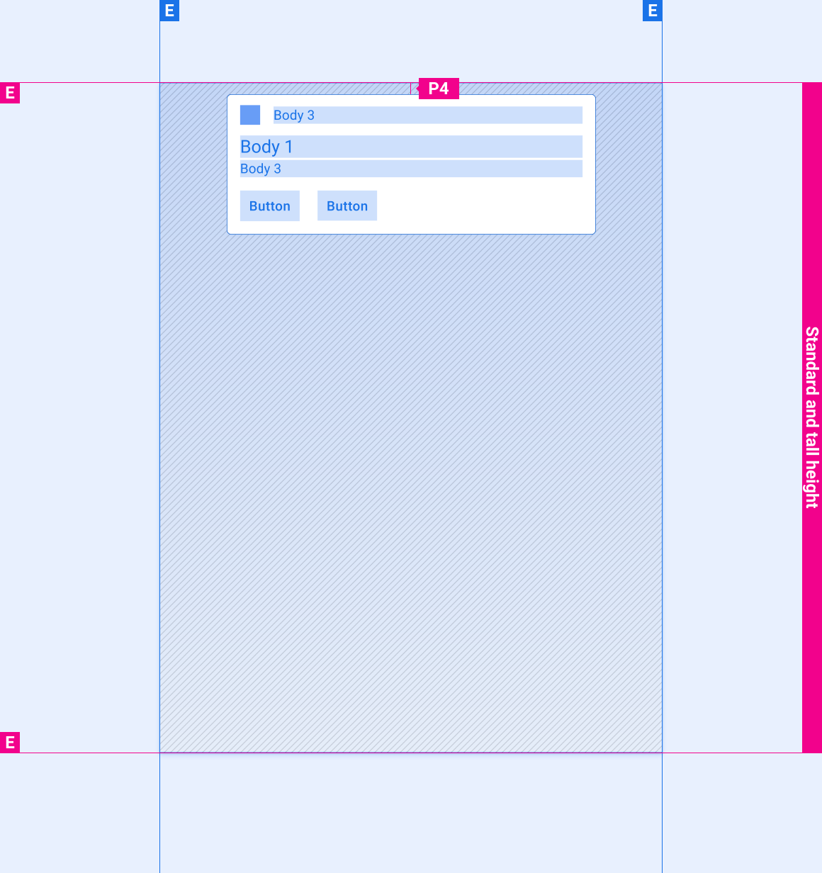
Tall and standard-height screens
Styles
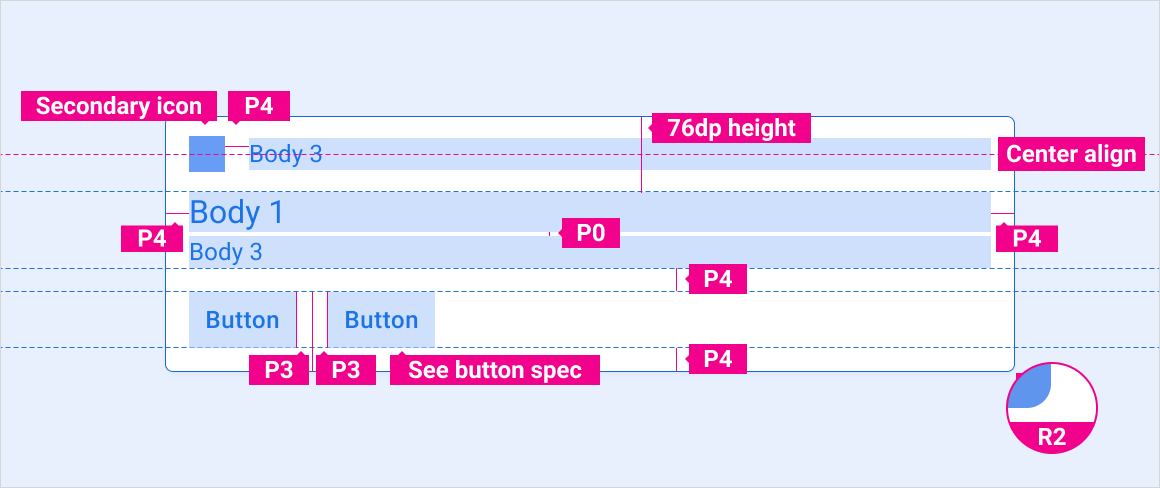
Typography
| Type style | Typeface | Weight | Size (dp) |
|---|---|---|---|
| Body 1 | Roboto | Regular | 32 |
| Body 3 M | Roboto | Medium | 24 |
| Body 3 | Roboto | Regular | 24 |
Color
| Element | Color(day mode) | Color (night mode) |
|---|---|---|
| Primary type / icons | White | White @ 88% |
| Secondary type | White @ 72% | White @ 60% |
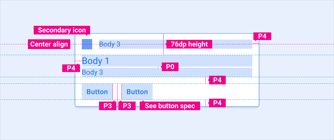
| Secondary icon | Third-party accent | Third-party accent |
| Divider hairline | White 22% | White 12% |
| Card background | Grey 868 | Grey 900 |
| Gradient Scrim | Black 100% - 0% | Black 100% - 20% |
Sizing
| Element | Size (dp) |
|---|---|
| Primary icon | 44 |
| Secondary icon | 36 |
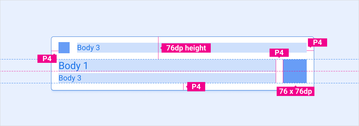
| Medium avatar | 76 |
| Rounded corner radius (R2) | 8 |
Examples
Motion
The following motions are an important part of the notification experience:
- HUN arrival motion
- Swipe motion for dismissing a notification
- Grouped-notification expand and collapse motions
HUN arrival
Swipe-to-dismiss
Grouped-notification expand and collapse