The app bar and header component is a dedicated bar at the top of the app canvas that can be customized to display important app-related functions, such as branding, top-level navigation, and access to app controls.
Use consistent app bar and header layouts to place key controls, such as in-app search, in a standard location throughout the UI.
Anatomy
The app bar and header can include a variety of elements. It can be configured in either of these ways:
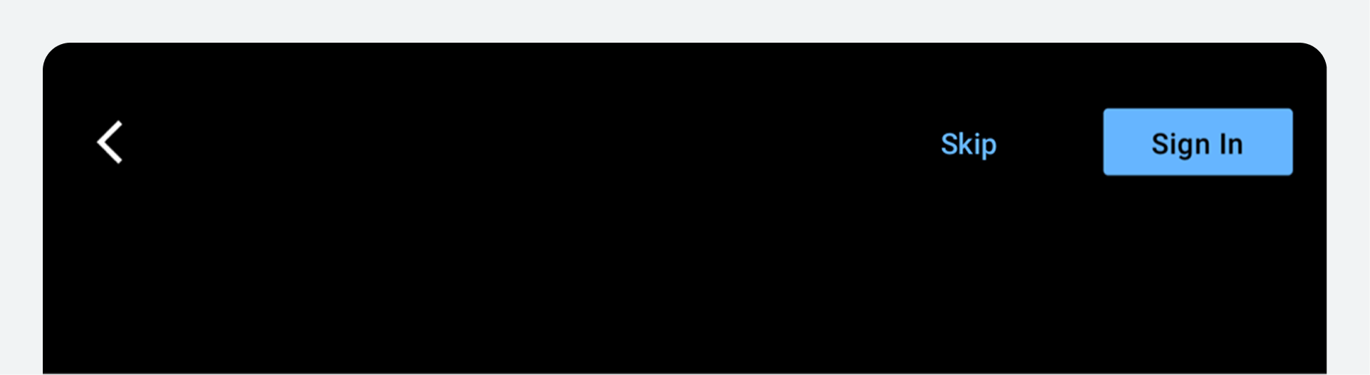
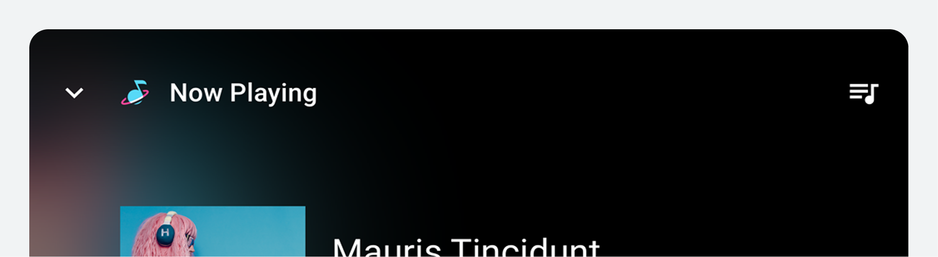
- App header: When configured as an app header, the component contains space for optional text, with minimal use of icons and buttons. Typically, it includes a screen title and back arrow.
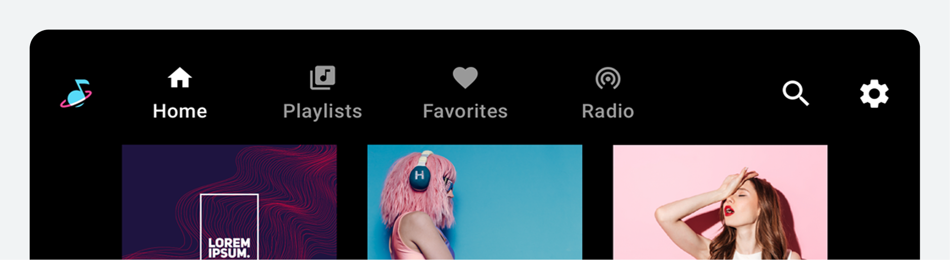
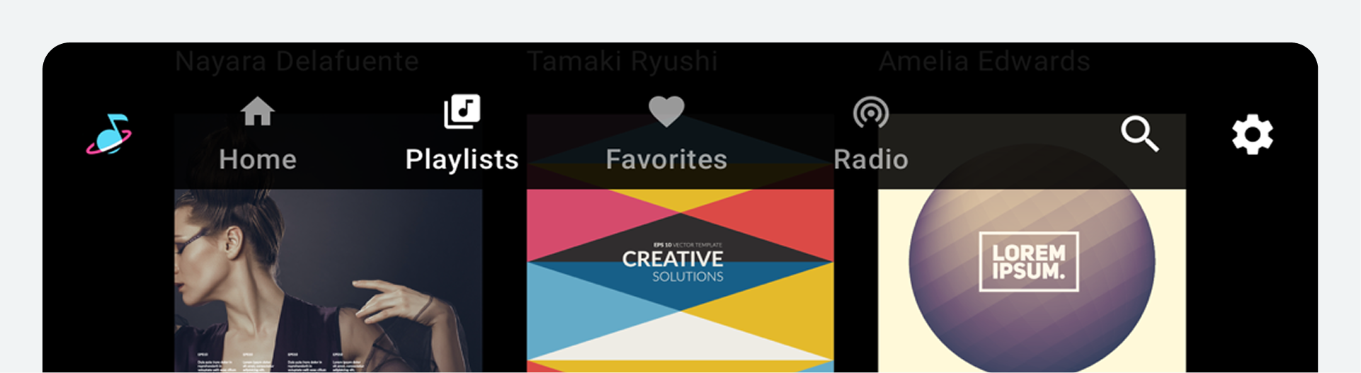
- App bar: When configured as an app bar, it can include icons, tabs, and buttons. Typical elements include an app icon and navigational options.
Either of these versions can also include app controls, such as in-app search and settings.
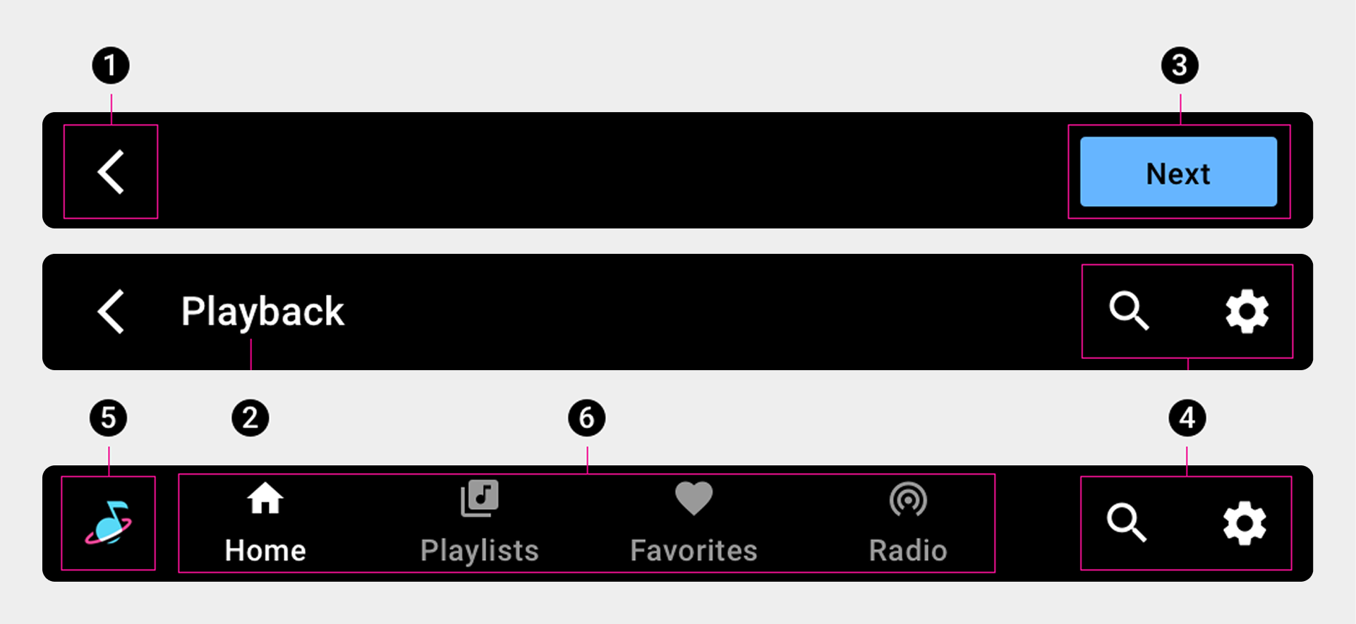
1. Back arrow
2. Screen title
3. Button
4. App controls
5. App icon
6. Primary navigation (tabs)
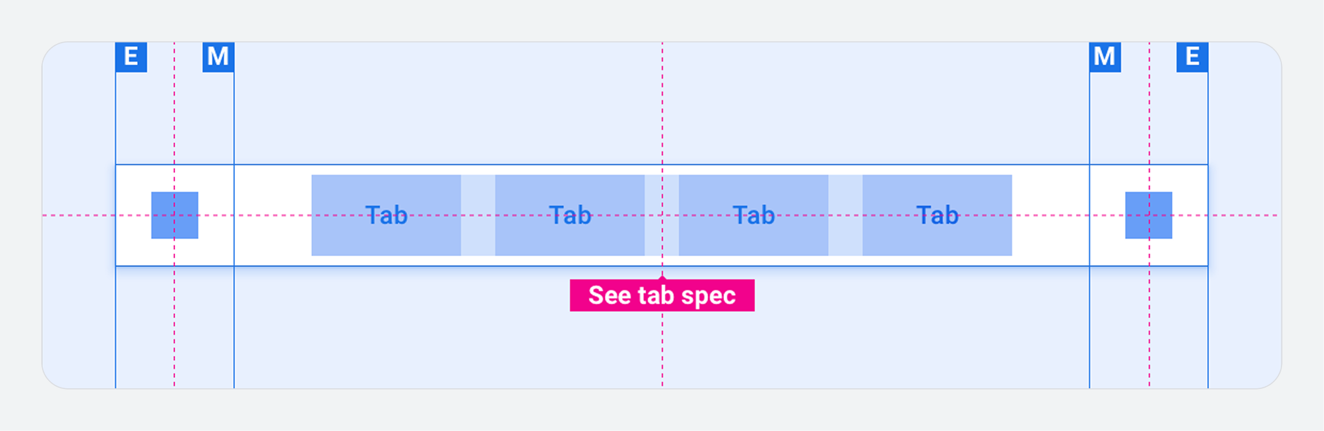
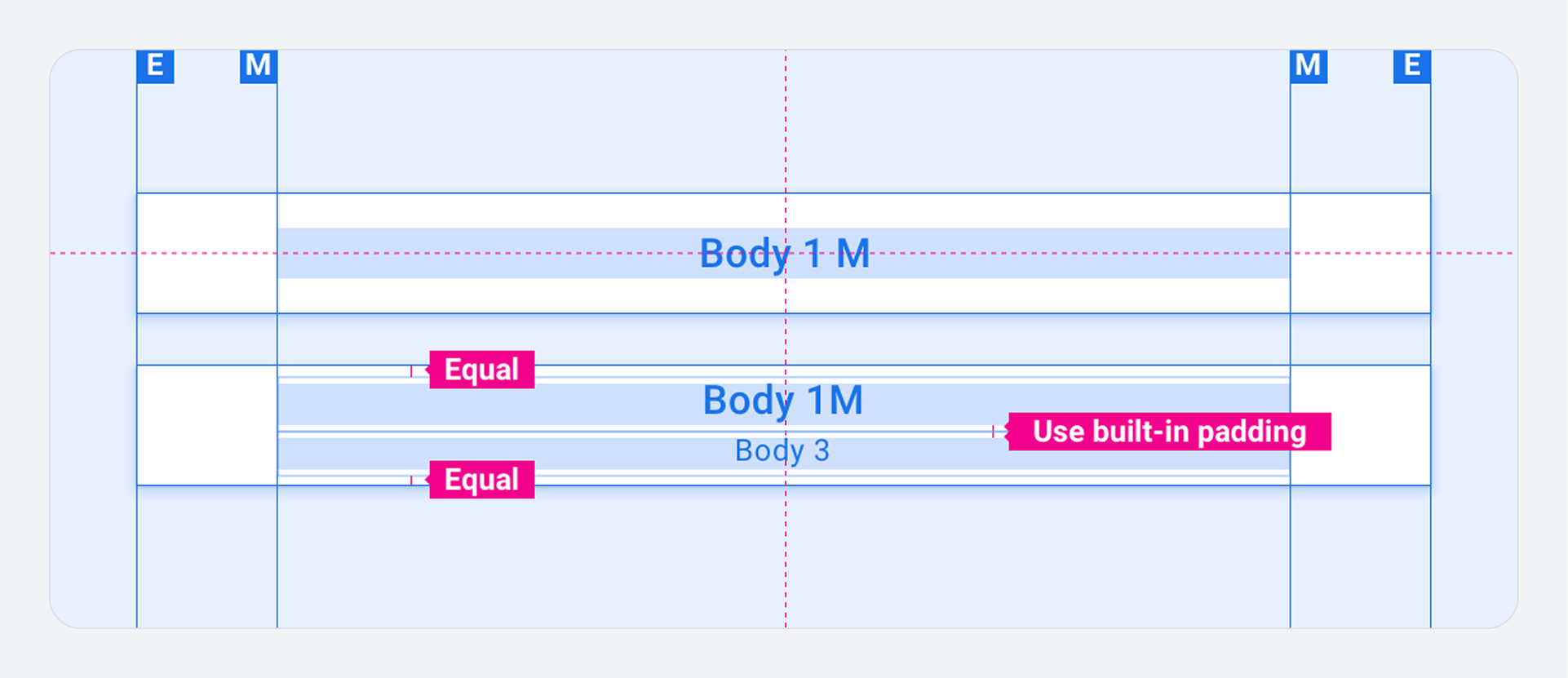
Specs – App bar
App bar with primary navigation – center aligned
App bar with primary navigation – left aligned
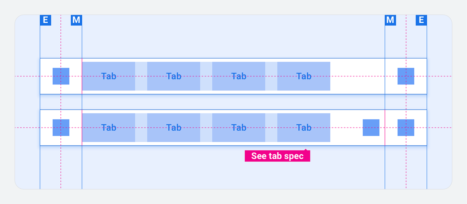
App bar with primary navigation – collapsed (drawer instead of tabs)
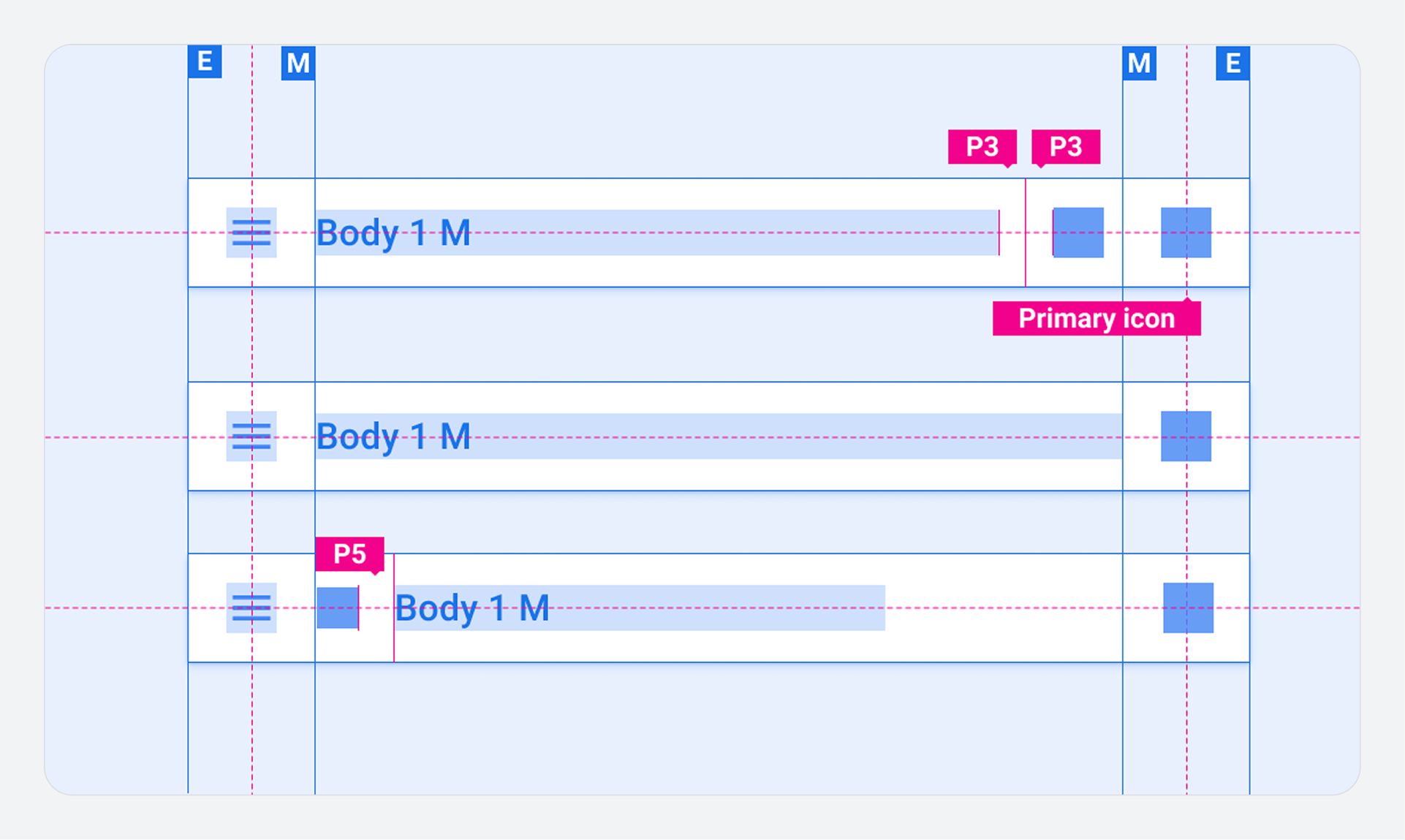
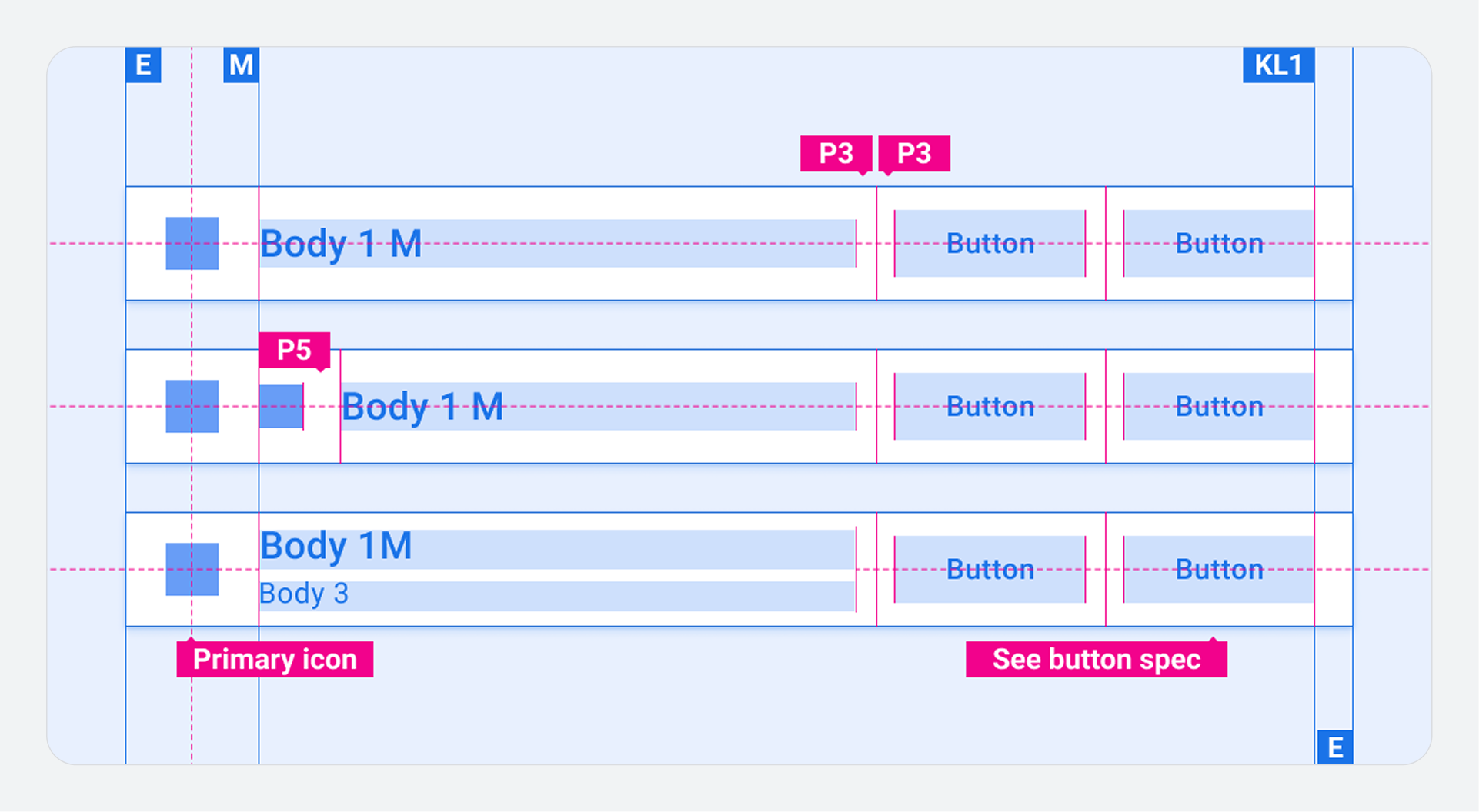
Specs – App header
App header with centered title
App header with single app control
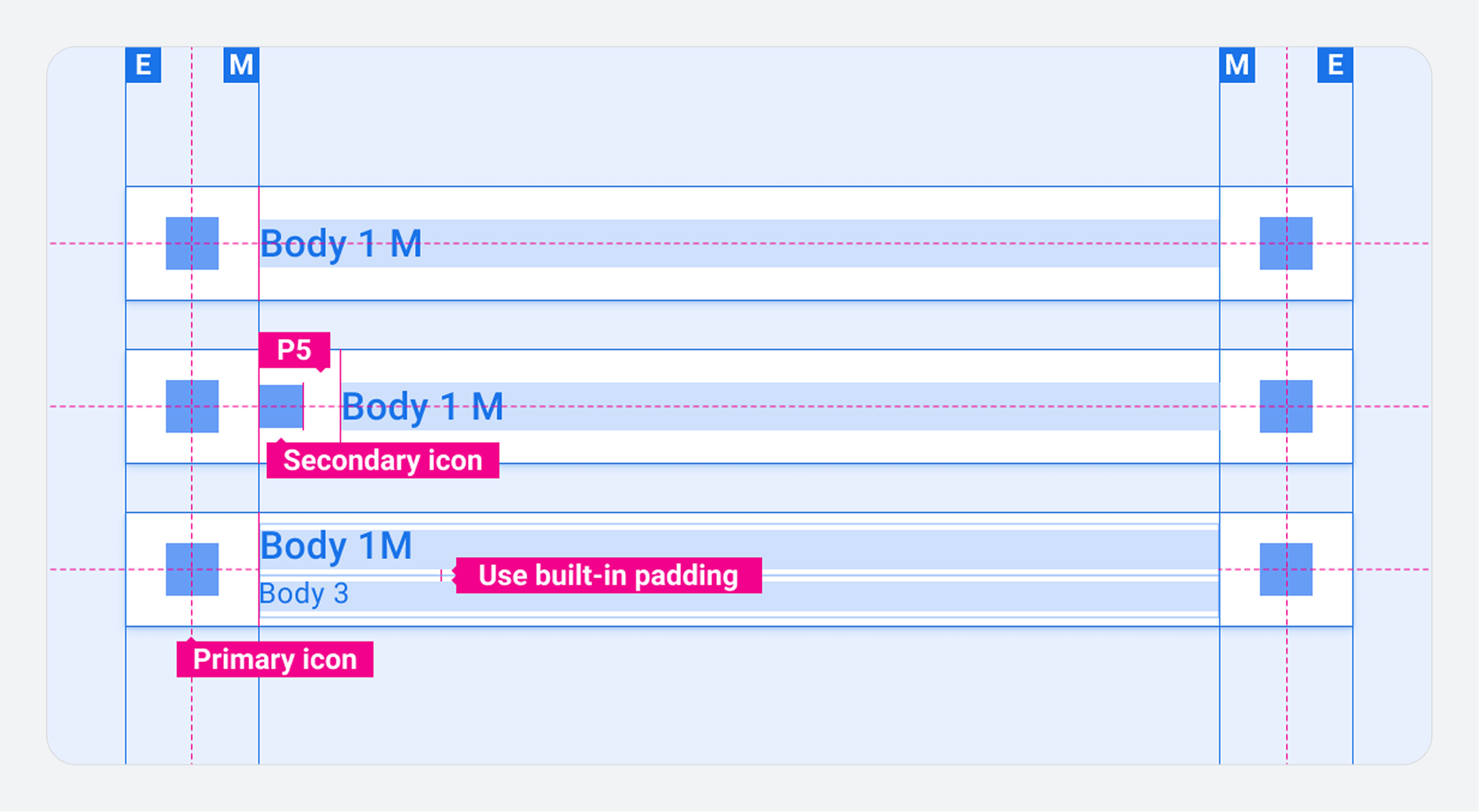
App header with multiple app controls
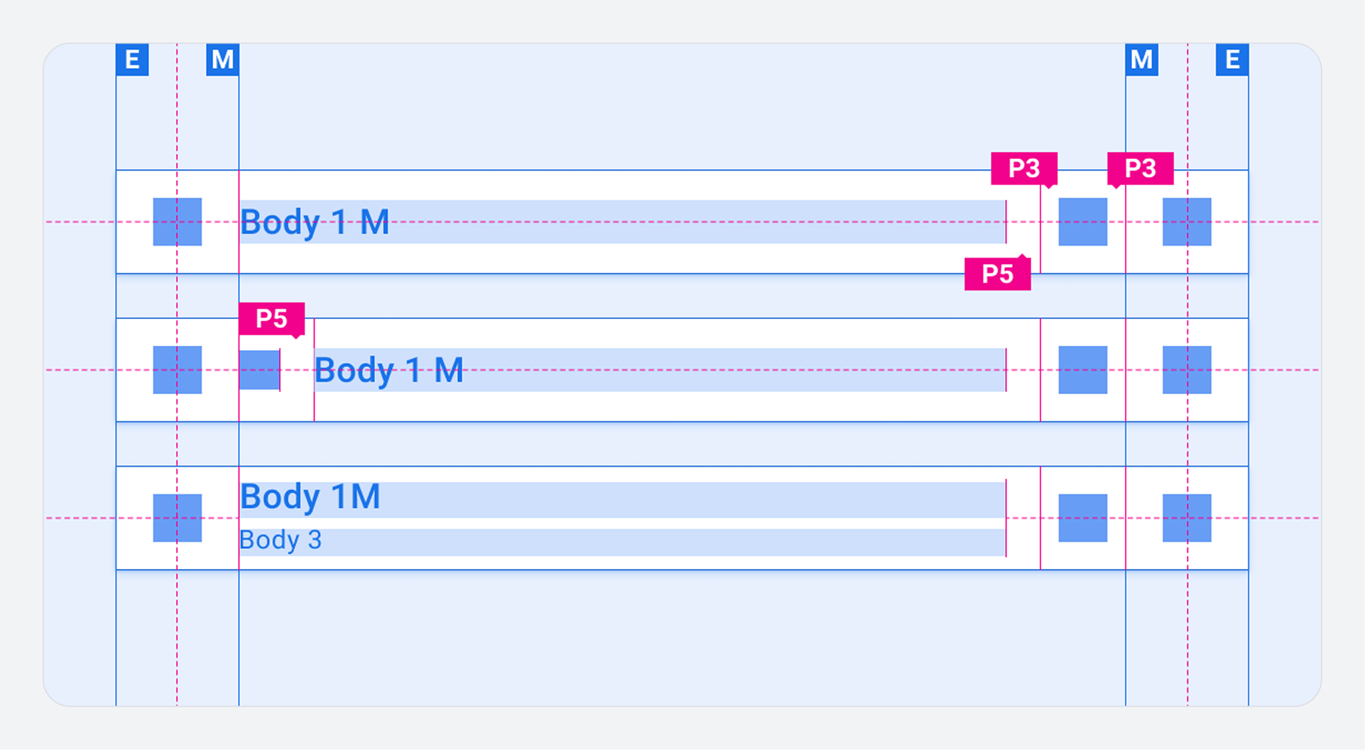
App header with single button
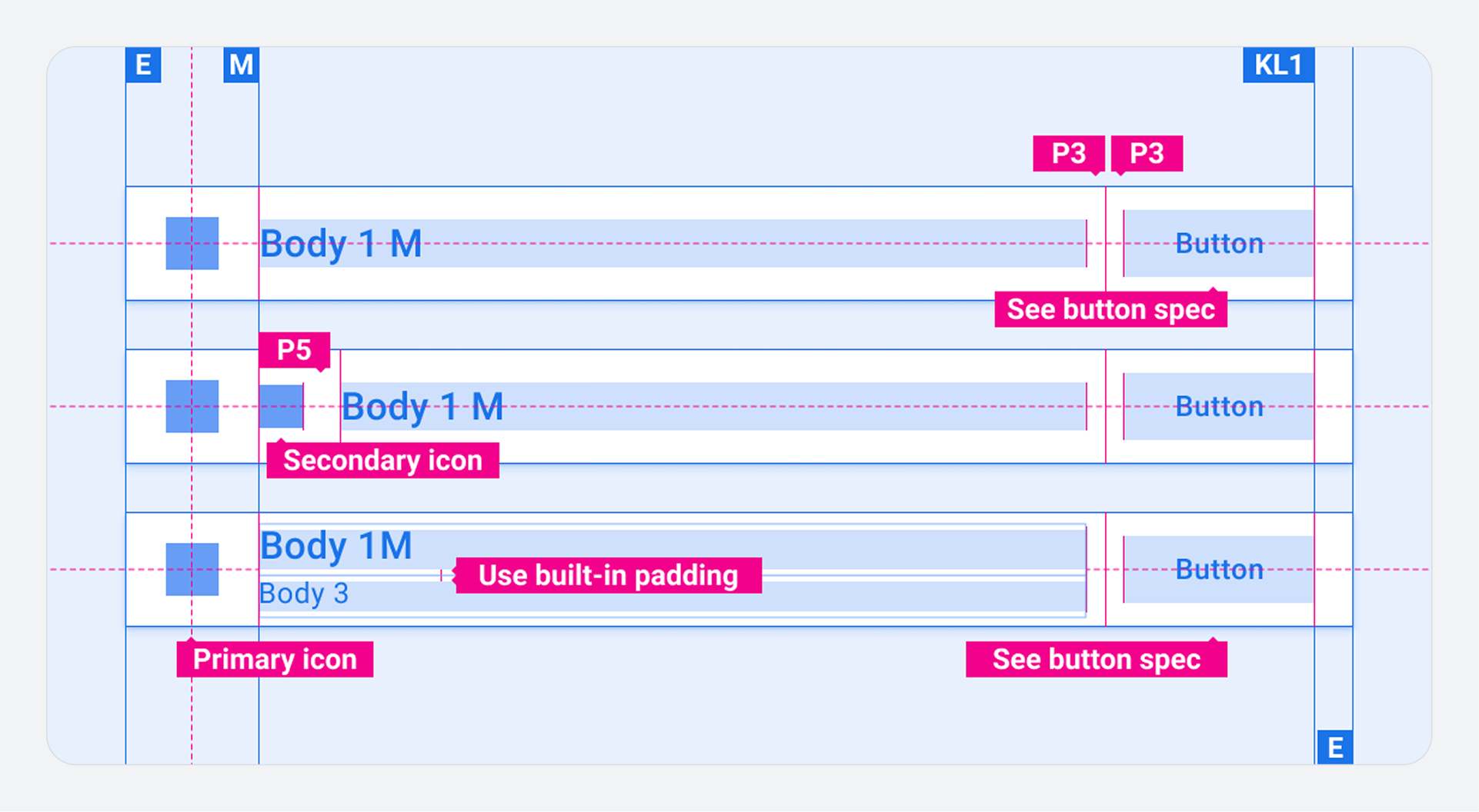
App header with multiple buttons
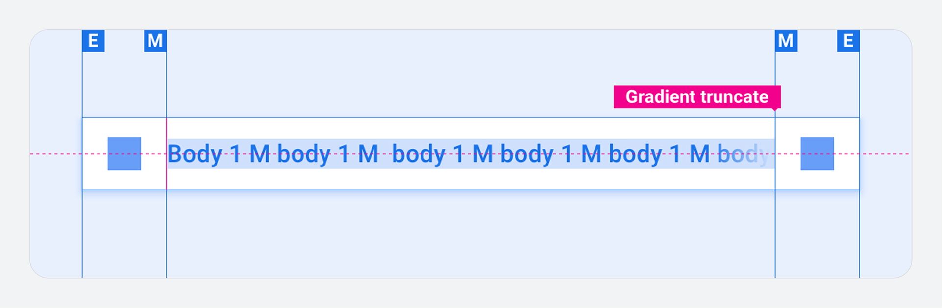
App header with text overflow
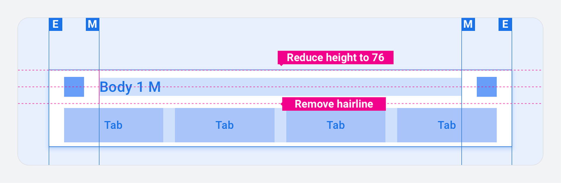
App header with standalone tab bar
Customization
You can express your brand by modifying the visual appearance of the app bar and header. Modifications might include:
- Custom icons
- Custom fonts
- Setting the appearance of active, inactive, and disabled buttons
- Setting button dimensions and placements
Examples