Buttons
Stay organized with collections
Save and categorize content based on your preferences.
A button communicates an action that occur when a user touches it.
Buttons are standard Android Open Source Project (AOSP) components. They can
either be filled with a solid background color, or unfilled (with a transparent
background). Filled buttons indicate a primary or preferred action. Buttons
can appear independently or in groups – unlike
tabs, which always appear in groups.
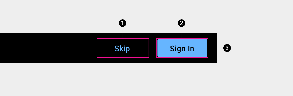
Anatomy
1. Unfilled button container
2. Filled button container, indicating the primary or preferred action
3. Button label
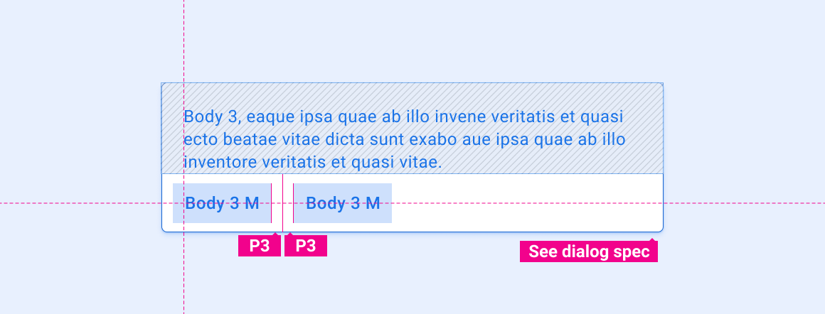
Specs
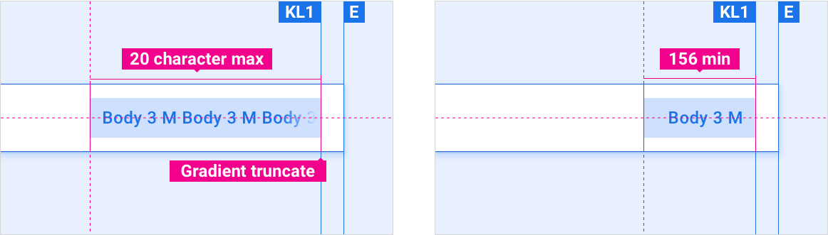
Button min and max length
Maximum button label length is 20 characters. Minimum button width is 156 dp.
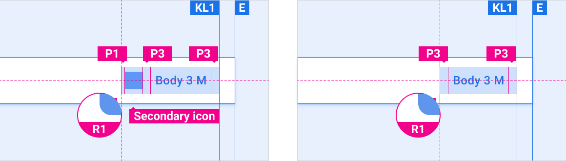
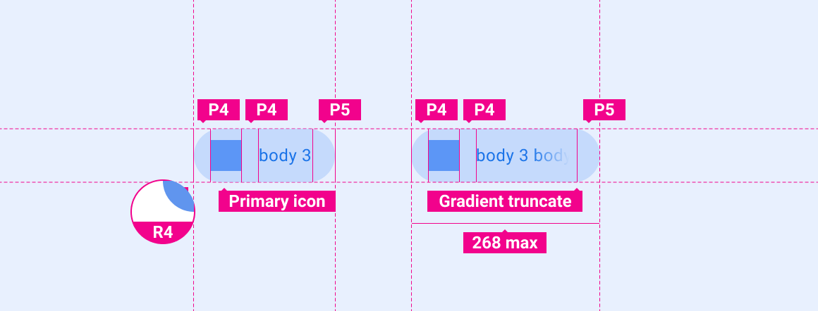
Button with icon vs. default button
Buttons can include icons. When included, icons typically appear to the left of button text.
Buttons can appear as elements in other components, such as the
app bar or
dialogs.
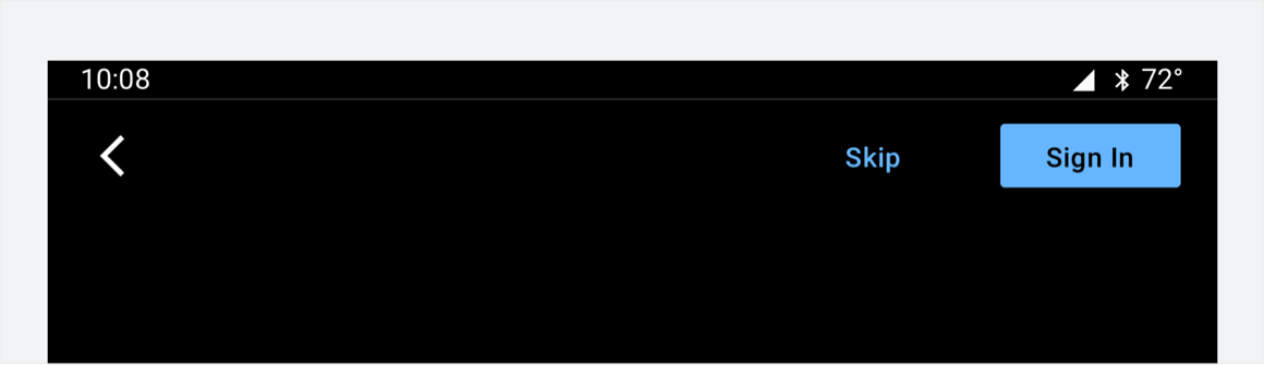
Button placement in app bar
Buttons are placed on the right side of the app bar.
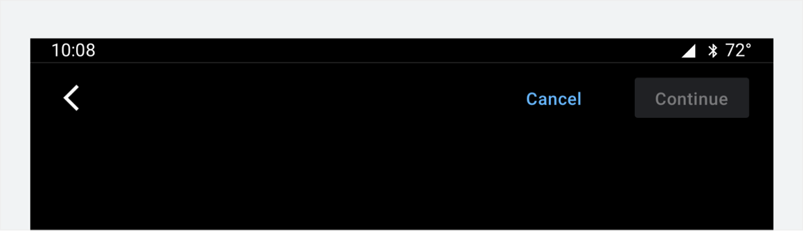
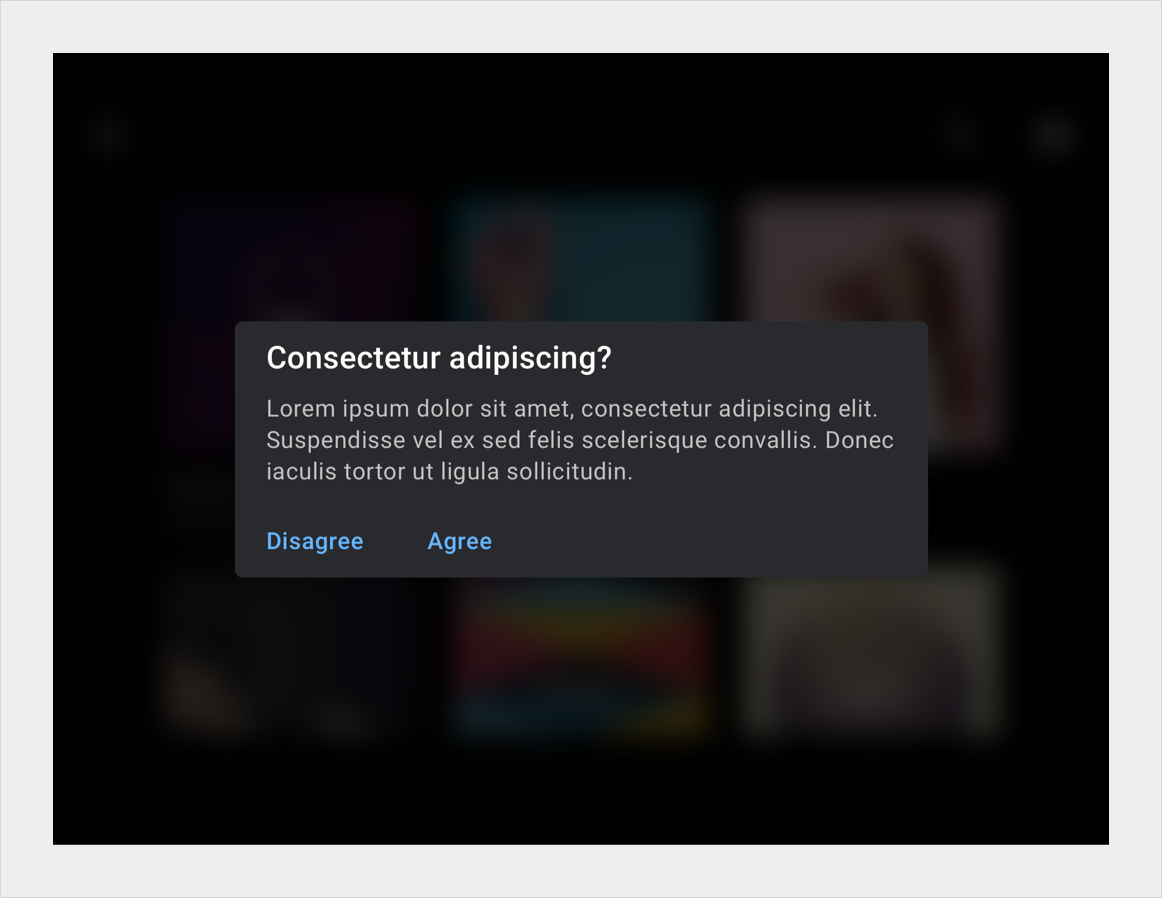
Button in dialog
Buttons in dialogs are typically located at the bottom left side of a dialog.
Hero button
Rounded edges emphasize the importance of a hero button.
Customization
OEMs can reflect their brand by modifying a button's visual appearance, such as:
Specifying an accent color
Supplying custom icons
Adding custom fonts
Changing the appearance of active, inactive, and disabled buttons
Setting button dimensions, corner shape, and placements
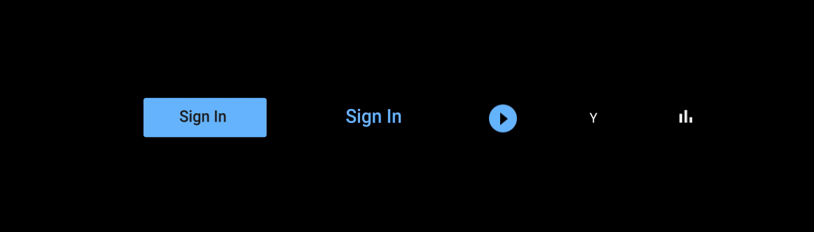
Unfilled and filled buttons, where the filled button indicates the primary action.
This filled button's color and opacity indicate a disabled state.
Unfilled buttons in a dialog indicate equally weighted actions.
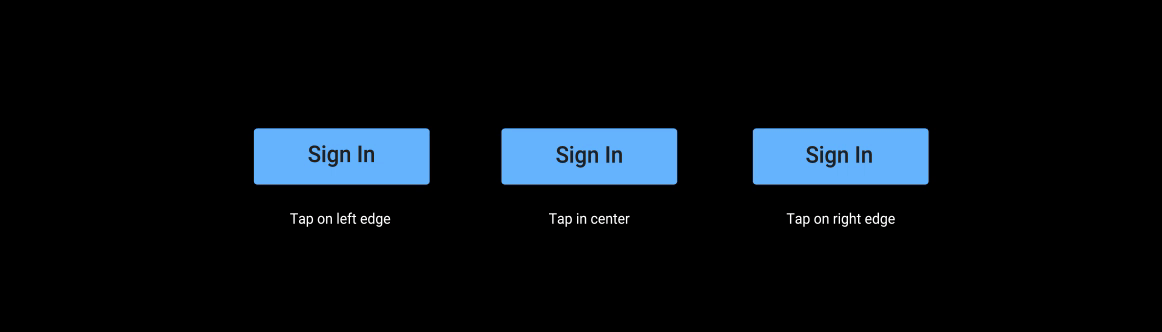
These ripple motions have a duration of 330 ms. They're used to confirm user contact with a button.
These ripple motions initially overlay 60% of the button surface. They expand away from the user's tap, and stop 10 dp from the button's edge.
[[["Easy to understand","easyToUnderstand","thumb-up"],["Solved my problem","solvedMyProblem","thumb-up"],["Other","otherUp","thumb-up"]],[["Missing the information I need","missingTheInformationINeed","thumb-down"],["Too complicated / too many steps","tooComplicatedTooManySteps","thumb-down"],["Out of date","outOfDate","thumb-down"],["Samples / code issue","samplesCodeIssue","thumb-down"],["Other","otherDown","thumb-down"]],["Last updated 2026-03-11 UTC."],[],[]]